Cash on Delivery (COD) as a Payment Method
Only <2% Rejected Items, No Backlash, Built Across App & Website.

Project Overview
Industry: e-Commerce
Research & Design Timeline: 4 months (2019) + 3 months (2020), parallel with other projects.
My Role: Solo Product Designer — Logistics Team, covering buyer and seller side.
Team: 2 PMs · 1 APM · 1 UX Researcher · 1 Copywriter · Engineers across 5 teams.
Tools: Figma, Miro, Marvel App.
Methods: UX Interview, User Journey, IA, Wireframe, Prototype, Usability Testing, Team Workshop & Weekly Sync.
About COD 📦: Introducing COD as a new payment method across Bukalapak's mobile app and website. Designing both the buyer and seller experience end-to-end, including the return flow, as a solo designer coordinating across five engineering teams.
Company 🛒: One of the biggest e-commerce in Indonesia. Their platform are: e-commerce Website, Mobile App, & Mitra App. I worked here since Oct 9th 2017 - Dec 18th 2020.
Background
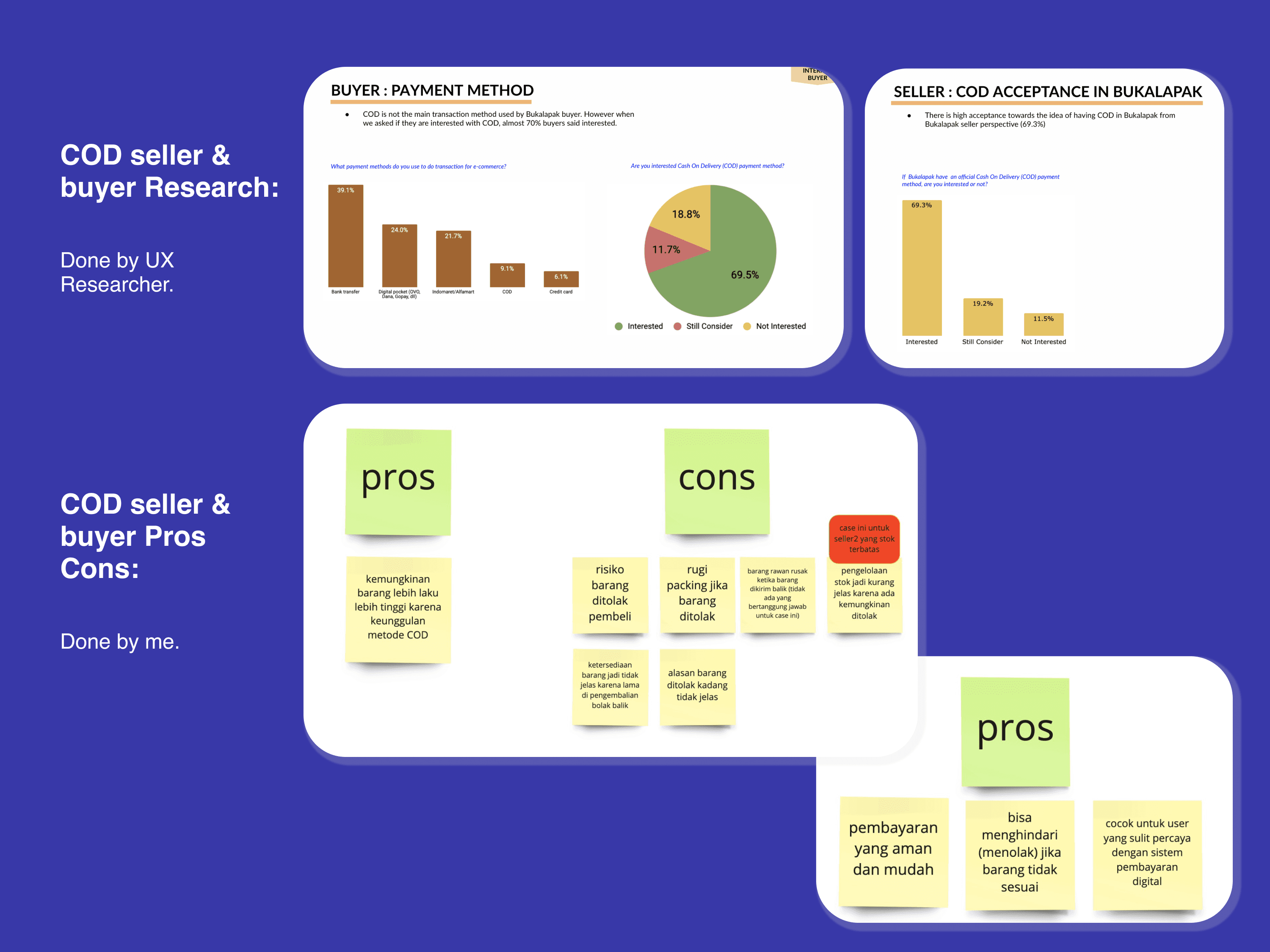
Bukalapak is one of Indonesia's largest e-commerce platforms, operating across a website, mobile app, and Mitra App. In 2019–2020, the logistics team was tasked with adding COD (Cash on Delivery) as a payment method: a feature highly requested by users in the C-D segment who preferred paying in cash rather than using digital payments.
I was the sole designer on this project, working across buyer side, seller side, and return flows simultaneously, coordinating with five engineering teams spread across different office locations.
Problem
COD sounds simple. In practice, it was a significant education and trust challenge. Because the way Bukalapak's COD worked was fundamentally different from what users expected.
The behavior gap:
Traditional COD in Indonesia means the courier arrives, the buyer inspects the package, and only then decides whether to pay. It's face-to-face, visual, and flexible.
Bukalapak's COD in 2020 worked differently: the buyer pays the courier first, before opening the package. COD here was purely a payment method: cash at the door, not an inspection mechanism.
This gap was the core design challenge. If users didn't understand this upfront, they would refuse to pay when the courier arrived, exactly what was happening to competitors at the time. Shopee faced significant backlash in 2020 from COD disputes: buyers and couriers arguing at the door, buyers refusing payment because they expected to inspect first.
Three design problems to solve:
1. How do you educate users about a COD model that contradicts their existing mental model, before they commit to checkout?
2. How do you connect the buyer and seller flow seamlessly, so sellers understand their responsibilities and terms, including the admin fee structure?
3. How do you design a return flow that protects both parties when something goes wrong, without creating confusion at an already high-friction moment?
And one personal challenge: doing all of this as a solo designer across five engineering teams, in parallel with two other projects, with teams sitting in different office locations.
Solution
The core insight: education can't happen at one touchpoint, it has to be layered across the entire journey.
Rather than a single disclaimer screen, I designed COD education as a system, surfacing the key term (pay before opening) at every moment where a user might be surprised by it:
At checkout: when a user selects COD as their payment method, the terms are shown clearly before they confirm. This is the highest-intent moment and the right time to set expectations.
On the transaction detail page: a persistent reminder after order is placed, so the buyer doesn't forget by the time the courier arrives.
On the package label: physical reinforcement at the final moment of truth, when the courier hands over the package.

This multi-touchpoint approach was intentional: the goal was not to reduce COD adoption, but to make sure every user who chose COD understood exactly what they were agreeing to. A user who dropped off at checkout after reading the terms was a better outcome than a user who reached the door and refused to pay.
To validate this, I added a tracker on the checkout page to monitor how many users exited after seeing the COD explanation, treating drop-off at this stage as a signal of informed decision-making rather than a failure metric.
Design Process
Discovery
Conducted UX interviews before launch to understand users' existing mental model of COD and map where the expectation gap would hit hardest
Mapped the full end-to-end touchpoint timeline across buyer, seller, courier, and return scenarios
Ran stakeholder alignment sessions to clarify Bukalapak's COD terms, including the admin fee structure for sellers and the courier's return fee policy
Design
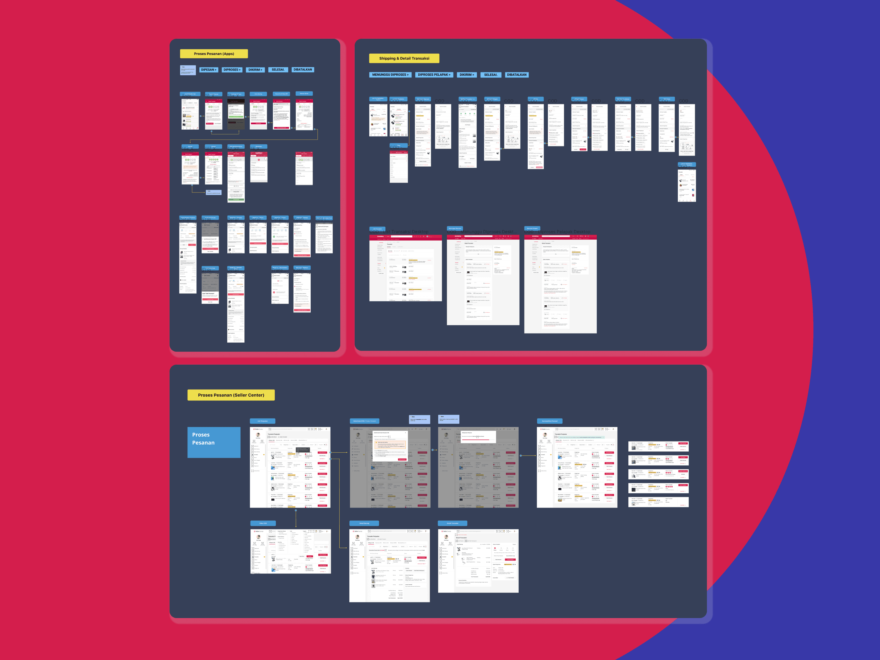
Built User Journey and IA covering all three flows: buyer, seller, and return
Designed both mobile app and website, maintaining consistency across platforms
Ran multiple prototype iterations before Usability Testing, covering happy path and corner cases (payment refusal, failed delivery, return initiation)
Applied the same principle I use across all projects: corner cases are not optional. Every error state and edge flow was designed deliberately — because when something goes wrong in a COD transaction, users need a clear next step, not a dead end.

Testing & Rollout
Conducted UAT with engineering teams to verify the built product matched the design spec
Ran a whitelist phase for both buyers and sellers before full rollout, a controlled release to catch issues before scale
Conducted post-launch UX interviews to validate whether the education touchpoints were landing
Coordinated weekly syncs across discovery, shipment, and return page teams, keeping five engineering workstreams aligned as a solo designer
Impacts
COD paid transactions grew consistently from the moment of launch, and this was before the feature had even reached 100% rollout on the app. The transaction goal was already being met in a partial release, which validated both the product-market fit and the clarity of the user journey.
The most telling metric: failed or rejected COD transactions stayed below 2%.
At a time when competitors were publicly dealing with COD disputes — buyers refusing to pay at the door, confrontations with couriers, platform-wide backlash: Bukalapak's COD launched quietly and held. The <2% failure rate wasn't just a UX win; it was proof that layering education across the journey worked. Users who reached the door had already read the terms three times. There was no surprise.


Reflection
This project was a lesson in designing for behavior change, not just task completion. The challenge wasn't the flow: it was the mental model. COD as a concept carried years of expectation that the product couldn't match. The design's job was to close that gap before it became a problem.
Doing this as a solo designer across five engineering teams also sharpened something I still rely on today: the ability to hold a complex, multi-sided product in your head: buyer, seller, return, platform, courier, and make decisions that hold up across all of them simultaneously.
" width="11.000000142661634px"><g opacity="0.996"><path d="M 5.594 0 L 6.31 0.036 C 6.345 0.099 6.42 0.123 6.536 0.108 C 6.892 0.248 7.175 0.458 7.384 0.74 C 7.606 1.044 7.757 1.417 7.836 1.858 C 7.821 2.065 7.846 2.234 7.911 2.363 L 7.911 3.626 L 7.873 3.662 L 7.836 4.131 L 7.685 4.601 L 7.252 5.16 C 7.018 5.357 6.717 5.489 6.348 5.557 L 5.519 5.557 L 5.029 5.34 L 4.916 5.34 L 4.596 5.521 C 4.421 5.745 4.358 6.088 4.408 6.549 L 4.596 7.595 L 4.822 8.173 L 4.822 8.281 C 4.97 8.692 5.203 9.023 5.519 9.273 C 5.648 9.378 5.849 9.414 6.122 9.381 L 6.178 9.327 C 6.162 9.156 6.187 9.024 6.253 8.93 L 6.687 8.443 C 6.915 8.241 7.204 8.097 7.553 8.01 C 7.741 7.95 7.98 7.938 8.269 7.974 C 8.743 8.097 9.113 8.32 9.38 8.642 L 9.531 8.822 C 10.002 9.345 10.391 9.946 10.699 10.626 L 10.925 11.276 L 10.925 11.817 C 10.826 12.192 10.644 12.486 10.378 12.701 C 10.121 12.924 9.82 13.104 9.474 13.242 L 8.231 13.675 L 7.666 13.747 L 7.515 13.82 L 7.252 13.82 L 7.026 13.892 L 6.649 13.892 L 6.611 13.928 L 6.084 13.964 L 6.046 13.928 L 5.217 13.892 L 4.238 13.603 C 3.671 13.361 3.187 13.048 2.788 12.665 C 1.88 11.76 1.177 10.647 0.678 9.327 C 0.428 8.689 0.24 7.991 0.113 7.235 L 0.075 6.621 L 0.038 6.585 L 0 5.286 L 0.038 5.25 L 0.075 4.384 L 0.339 3.446 C 0.545 2.989 0.796 2.586 1.092 2.237 C 1.16 2.264 1.185 2.246 1.168 2.183 C 1.589 1.732 2.085 1.354 2.656 1.046 L 4.125 0.397 L 4.464 0.325 L 4.577 0.253 L 4.728 0.253 L 5.293 0.036 C 5.45 0.078 5.55 0.066 5.594 0 Z M 5.801 0.974 C 5.626 0.974 5.513 1.022 5.462 1.119 C 5.387 1.095 5.362 1.119 5.387 1.191 L 5.312 1.191 L 5.199 1.443 L 5.199 2.562 L 5.236 2.598 L 5.274 3.5 L 5.312 3.536 L 5.387 4.149 L 5.5 4.438 C 5.6 4.582 5.826 4.631 6.178 4.582 L 6.253 4.582 L 6.517 4.474 L 6.743 4.149 L 6.856 3.608 C 6.881 3.055 6.869 2.562 6.818 2.129 C 6.793 1.768 6.693 1.491 6.517 1.299 C 6.442 1.131 6.304 1.034 6.103 1.01 L 6.027 1.01 Z M 4.219 1.443 C 3.491 1.708 2.863 2.057 2.336 2.49 C 1.909 2.875 1.57 3.344 1.318 3.897 C 1.193 4.186 1.118 4.522 1.092 4.907 L 1.092 6.423 C 1.168 6.615 1.193 6.856 1.168 7.144 L 1.243 7.325 L 1.318 7.866 C 1.62 9.093 2.11 10.151 2.788 11.041 C 2.763 11.089 2.788 11.101 2.863 11.077 C 3.089 11.486 3.39 11.835 3.767 12.124 C 3.817 12.1 3.83 12.124 3.805 12.196 L 4.671 12.701 C 4.973 12.821 5.337 12.905 5.764 12.954 C 6.618 12.978 7.358 12.893 7.986 12.701 C 8.087 12.725 8.124 12.701 8.099 12.629 L 8.062 12.629 L 7.723 12.34 C 7.748 12.268 7.723 12.244 7.647 12.268 C 7.17 11.739 6.768 11.125 6.442 10.428 L 6.404 10.356 L 5.538 10.356 C 5.186 10.259 4.91 10.103 4.709 9.887 L 4.596 9.814 C 4.269 9.454 4.006 9.045 3.805 8.588 L 3.654 8.01 L 3.579 7.902 L 3.579 7.722 L 3.503 7.577 L 3.503 7.397 L 3.428 7.216 C 3.453 7 3.428 6.844 3.353 6.747 C 3.277 5.954 3.403 5.364 3.729 4.979 C 3.905 4.739 4.144 4.57 4.445 4.474 L 4.332 3.933 L 4.295 3.392 L 4.257 3.356 L 4.257 1.624 L 4.295 1.588 C 4.345 1.467 4.32 1.419 4.219 1.443 Z M 7.873 8.948 L 7.685 9.057 C 7.584 9.033 7.547 9.057 7.572 9.129 L 7.459 9.165 C 7.333 9.237 7.245 9.357 7.195 9.526 C 7.22 9.814 7.296 10.067 7.421 10.284 L 8.099 11.33 L 8.589 11.871 L 9.041 12.196 L 9.342 12.196 L 9.606 12.015 L 9.719 11.943 C 9.795 11.871 9.845 11.775 9.87 11.655 L 9.832 11.294 L 9.606 10.753 C 9.305 10.199 8.966 9.694 8.589 9.237 L 8.212 8.985 Z" fill="rgb(17, 30, 137)" height="13.963917466353273px" id="Ax8QfdOjo" stroke-dasharray="" stroke-linecap="butt" stroke-linejoin="miter" stroke-miterlimit="10" stroke-width="0.06" stroke="rgb(17, 30, 137)" transform="translate(0.038 0.036)" width="10.924657232911954px"/></g><g opacity="0.545"><path d="M 5.406 0 L 5.462 0.018 L 5.406 0.036 Z M 6.122 0 L 6.216 0.018 L 6.122 0.036 Z M 7.365 0.686 L 7.402 0.758 M 1.978 1.443 L 1.94 1.515 M 1.789 1.588 L 1.752 1.66 M 1.488 1.84 L 1.375 1.985 M 7.854 1.948 L 7.873 2.003 L 7.836 2.003 Z M 0.998 2.345 L 0.961 2.418 M 2.543 2.634 L 2.317 2.887 M 3.522 2.706 L 3.485 2.778 M 3.146 2.995 L 3.108 3.067 M 2.015 3.211 L 1.978 3.284 M 2.693 3.428 L 2.656 3.5 M 7.854 3.969 L 7.873 4.059 L 7.836 4.059 Z M 0.057 4.51 L 0.075 4.564 L 0.038 4.564 Z M 7.553 4.835 L 7.515 4.907 M 0.019 4.907 L 0.038 4.961 L 0 4.961 Z M 7.44 4.979 L 7.327 5.124 M 4.841 5.376 L 4.803 5.448 M 5.594 5.557 L 5.651 5.575 L 5.594 5.593 Z M 4.426 6.098 L 4.445 6.188 L 4.408 6.188 Z M 4.426 6.242 L 4.445 6.369 L 4.408 6.369 Z M 0.019 6.351 L 0.038 6.441 L 0 6.441 Z M 0.057 6.747 L 0.075 6.802 L 0.038 6.802 Z M 0.132 7.325 L 0.151 7.379 L 0.113 7.379 Z M 7.817 7.938 L 8.137 7.956 L 7.817 7.974 Z M 6.687 8.407 L 6.649 8.479 M 9.286 8.515 L 9.361 8.624 M 6.423 8.66 L 6.385 8.732 M 5.142 8.804 L 5.18 8.876 M 6.159 9.237 L 6.178 9.291 L 6.14 9.291 Z M 5.858 9.345 L 6.103 9.363 L 5.858 9.381 Z M 10.943 11.402 L 10.962 11.673 L 10.925 11.673 Z M 7.365 13.82 L 7.421 13.838 L 7.365 13.856 Z M 5.368 13.892 L 5.462 13.91 L 5.368 13.928 Z M 6.8 13.892 L 6.856 13.91 L 6.8 13.928 Z" fill="rgb(62, 73, 141)" height="13.927834717268794px" id="LPkTtYxuQ" stroke-dasharray="" stroke-linecap="butt" stroke-linejoin="miter" stroke-miterlimit="10" stroke-width="0.06" stroke="rgb(62, 73, 141)" transform="translate(0.038 0.036)" width="10.962328099814954px"/></g><g opacity="0.996"><path d="M 4.69 0 L 4.916 0.036 L 4.973 0.018 L 4.86 0.162 C 4.891 0.277 4.878 0.349 4.822 0.379 L 4.822 1.353 L 4.86 1.389 L 4.86 2.219 C 4.932 2.354 4.957 2.534 4.935 2.76 L 5.048 3.374 L 5.161 3.59 L 5.067 3.608 C 4.734 3.656 4.514 3.608 4.408 3.464 L 4.295 3.157 L 4.219 2.544 L 4.182 2.508 L 4.144 1.606 L 4.106 1.57 L 4.106 0.451 L 4.219 0.216 L 4.295 0.216 C 4.266 0.152 4.285 0.128 4.351 0.144 C 4.421 0.055 4.534 0.007 4.69 0 Z M 5.029 0.036 C 5.199 0.09 5.33 0.18 5.425 0.307 L 5.255 0.18 L 5.029 0.072 Z M 5.443 0.361 L 5.481 0.433 M 3.108 0.469 C 3.213 0.438 3.244 0.48 3.202 0.595 L 3.164 0.631 L 3.164 2.363 L 3.202 2.399 L 3.24 2.941 L 3.353 3.5 C 3.061 3.596 2.822 3.758 2.637 3.987 C 2.306 4.38 2.181 4.969 2.26 5.755 C 2.327 5.871 2.352 6.028 2.336 6.224 L 2.411 6.405 L 2.411 6.585 L 2.486 6.729 L 2.486 6.91 L 2.562 7.018 L 2.712 7.595 C 2.903 8.074 3.16 8.489 3.485 8.84 L 3.598 8.912 C 3.808 9.132 4.084 9.288 4.426 9.381 L 5.293 9.381 L 5.349 9.436 C 5.663 10.15 6.065 10.769 6.555 11.294 C 6.622 11.267 6.647 11.285 6.63 11.348 L 6.95 11.655 L 7.007 11.655 C 7.04 11.735 6.996 11.759 6.875 11.727 C 6.249 11.921 5.509 12.006 4.652 11.979 C 4.243 11.938 3.879 11.854 3.56 11.727 L 2.712 11.222 C 2.741 11.157 2.722 11.133 2.656 11.149 C 2.283 10.858 1.988 10.51 1.771 10.103 C 1.703 10.13 1.678 10.112 1.695 10.049 C 1.028 9.161 0.538 8.102 0.226 6.874 L 0.151 6.332 L 0.075 6.152 C 0.096 5.867 0.071 5.627 0 5.43 L 0 3.915 C 0.034 3.538 0.109 3.202 0.226 2.905 C 0.466 2.353 0.799 1.89 1.224 1.515 C 1.758 1.076 2.386 0.727 3.108 0.469 Z M 2.449 1.01 C 1.946 1.227 1.532 1.527 1.205 1.912 C 1.231 1.96 1.205 1.973 1.13 1.948 L 0.678 2.634 L 0.339 3.572 L 0.377 3.897 L 0.603 4.005 L 0.904 3.969 L 1.055 3.825 C 1.13 3.247 1.318 2.79 1.62 2.454 L 2.26 1.876 L 2.788 1.624 L 2.938 1.479 C 2.963 1.287 2.938 1.155 2.863 1.082 C 2.788 1.01 2.65 0.986 2.449 1.01 Z M 5.594 0.613 L 5.613 0.668 L 5.575 0.668 Z M 5.632 0.722 L 5.651 0.776 L 5.613 0.776 Z M 5.67 0.902 L 5.688 1.028 L 5.651 1.028 Z M 5.707 1.119 L 5.726 1.281 L 5.688 1.281 Z M 5.745 1.479 L 5.764 2.616 L 5.726 2.616 Z M 5.707 2.778 L 5.726 2.869 L 5.688 2.869 Z M 5.67 2.923 L 5.688 3.013 L 5.651 3.013 Z M 5.632 3.103 L 5.651 3.157 L 5.594 3.247 L 5.575 3.193 Z M 5.557 3.284 L 5.519 3.356 M 5.481 3.392 L 5.406 3.5 L 5.33 3.536 L 5.368 3.464 Z M 6.762 7.974 L 7.007 7.992 L 6.762 8.01 Z M 6.649 8.01 L 6.63 8.064 L 6.705 8.461 L 7.158 9.255 L 7.873 10.302 L 8.382 10.825 L 8.608 10.933 L 8.683 10.825 L 8.702 10.879 L 8.551 10.969 C 8.58 11.033 8.561 11.057 8.495 11.041 L 8.231 11.222 L 7.93 11.222 L 7.497 10.879 L 7.007 10.338 L 6.329 9.291 C 6.197 9.092 6.122 8.84 6.103 8.534 C 6.141 8.378 6.223 8.264 6.348 8.191 L 6.479 8.155 C 6.448 8.082 6.479 8.058 6.574 8.082 Z M 7.252 8.082 L 7.365 8.227 M 7.44 8.263 C 7.497 8.245 7.515 8.263 7.497 8.317 L 7.798 8.642 L 7.647 8.534 Z M 7.817 8.696 L 7.854 8.768 M 7.892 8.804 L 7.93 8.876 M 7.967 8.912 L 8.005 8.985 M 8.043 9.021 L 8.08 9.093 M 8.118 9.129 L 8.212 9.255 L 8.137 9.219 Z M 8.269 9.381 L 8.363 9.508 L 8.288 9.472 Z M 8.457 9.706 L 8.514 9.796 L 8.476 9.796 Z M 8.533 9.851 L 8.589 9.941 L 8.551 9.941 Z M 8.608 9.995 L 8.664 10.121 L 8.627 10.121 Z M 8.683 10.175 L 8.702 10.229 L 8.664 10.229 Z M 8.721 10.284 L 8.74 10.338 L 8.702 10.338 Z M 8.759 10.428 L 8.777 10.662 L 8.74 10.662 Z" fill="rgb(47, 91, 188)" height="11.984050498615659px" id="qKAurkFxx" stroke-dasharray="" stroke-linecap="butt" stroke-linejoin="miter" stroke-miterlimit="10" stroke-width="0.06" stroke="rgb(47, 91, 188)" transform="translate(1.13 1.01)" width="8.77739825209764px"/></g><g opacity="0.165"><path d="M 5.557 0 L 5.651 0.018 L 5.557 0.036 Z M 6.009 0 L 6.103 0.018 L 6.009 0.036 Z M 4.878 0.18 L 4.973 0.198 L 4.878 0.216 Z M 4.351 0.325 L 4.408 0.343 L 4.351 0.361 Z M 7.101 0.397 L 7.139 0.469 M 7.478 0.794 L 7.515 0.866 M 2.091 1.407 L 2.053 1.479 M 1.94 1.515 L 1.902 1.588 M 7.817 1.515 L 7.836 1.57 L 7.798 1.57 Z M 1.714 1.696 L 1.676 1.768 M 7.892 1.84 L 7.911 1.93 L 7.873 1.93 Z M 7.93 2.093 L 7.949 2.147 L 7.911 2.147 Z M 1.111 2.273 L 1.074 2.345 M 3.07 2.309 L 3.033 2.381 M 0.961 2.454 L 0.923 2.526 M 4.012 2.49 L 3.937 2.598 M 2.769 2.526 L 2.58 2.742 M 7.967 2.526 L 7.986 2.652 L 7.949 2.652 Z M 0.885 2.562 L 0.848 2.634 M 3.522 2.742 L 3.485 2.814 M 3.334 2.887 L 3.296 2.959 M 2.354 2.923 L 2.204 3.103 M 3.108 3.067 L 3.07 3.139 M 2.053 3.284 L 2.015 3.356 M 2.769 3.392 L 2.731 3.464 M 7.967 3.428 L 7.986 3.554 L 7.949 3.554 Z M 2.656 3.536 L 2.618 3.608 M 0.17 4.005 L 0.188 4.059 L 0.151 4.059 Z M 2.354 4.077 L 2.373 4.131 L 2.336 4.131 Z M 7.892 4.149 L 7.911 4.204 L 7.873 4.204 Z M 2.279 4.294 L 2.298 4.348 L 2.26 4.348 Z M 0.094 4.366 L 0.113 4.456 L 0.075 4.456 Z M 7.817 4.438 L 7.836 4.492 L 7.798 4.492 Z M 2.204 4.582 L 2.223 4.637 L 2.185 4.637 Z M 1.488 4.619 L 1.507 4.709 L 1.469 4.709 Z M 0.057 4.799 L 0.075 4.853 L 0.038 4.853 Z M 7.666 4.799 L 7.628 4.871 M 2.128 4.835 L 2.053 4.943 M 1.789 4.979 L 1.884 4.997 L 1.789 5.015 Z M 0.019 5.124 L 0.038 6.224 L 0 6.224 Z M 7.214 5.268 L 7.176 5.34 M 6.536 5.557 L 6.592 5.575 L 6.536 5.593 Z M 5.783 5.629 L 6.216 5.647 L 5.783 5.665 Z M 4.502 5.954 L 4.521 6.08 L 4.483 6.08 Z M 4.502 6.495 L 4.521 6.693 L 4.483 6.693 Z M 0.057 6.567 L 0.075 6.621 L 0.038 6.621 Z M 0.094 6.964 L 0.113 7.054 L 0.075 7.054 Z M 4.577 7.072 L 4.596 7.162 L 4.558 7.162 Z M 0.132 7.18 L 0.151 7.235 L 0.113 7.235 Z M 4.652 7.433 L 4.671 7.487 L 4.634 7.487 Z M 0.17 7.469 L 0.188 7.523 L 0.151 7.523 Z M 4.728 7.722 L 4.747 7.776 L 4.709 7.776 Z M 8.834 8.155 L 8.872 8.227 M 0.358 8.299 L 0.377 8.353 L 0.339 8.353 Z M 6.837 8.335 L 6.8 8.407 M 9.135 8.371 L 9.173 8.443 M 6.649 8.479 L 6.498 8.66 M 0.433 8.552 L 0.452 8.606 L 0.414 8.606 Z M 6.385 8.768 L 6.348 8.84 M 0.509 8.804 L 0.527 8.858 L 0.49 8.858 Z M 0.584 9.021 L 0.603 9.075 L 0.565 9.075 Z M 5.33 9.021 L 5.406 9.129 M 6.197 9.129 L 6.216 9.183 L 6.178 9.183 Z M 5.519 9.201 L 5.557 9.273 M 0.659 9.237 L 0.678 9.291 L 0.64 9.291 Z M 5.783 9.345 L 5.839 9.363 L 5.783 9.381 Z M 10.265 9.742 L 10.303 9.814 M 10.83 10.789 L 10.849 10.843 L 10.812 10.843 Z M 10.906 11.005 L 10.925 11.059 L 10.887 11.059 Z M 10.981 11.258 L 11 11.348 L 10.962 11.348 Z M 1.714 11.366 L 1.752 11.438 M 1.865 11.582 L 1.902 11.655 M 10.981 11.799 L 11 11.889 L 10.962 11.889 Z M 2.279 12.124 L 2.354 12.232 M 2.505 12.376 L 2.58 12.485 M 10.68 12.485 L 10.642 12.557 M 2.882 12.737 L 3.033 12.918 M 10.341 12.809 L 10.303 12.881 M 10.19 12.918 L 10.152 12.99 M 3.221 13.026 L 3.259 13.098 M 3.522 13.242 L 3.56 13.314 M 9.587 13.242 L 9.644 13.26 L 9.587 13.278 Z M 3.748 13.387 L 3.786 13.459 M 8.269 13.711 L 8.325 13.729 L 8.269 13.747 Z M 7.892 13.784 L 7.986 13.802 L 7.892 13.82 Z M 4.916 13.856 L 4.973 13.874 L 4.916 13.892 Z M 7.515 13.856 L 7.61 13.874 L 7.515 13.892 Z M 5.293 13.928 L 5.349 13.946 L 5.293 13.964 Z M 5.557 13.964 L 5.651 13.982 L 5.557 14 Z M 6.649 13.964 L 6.743 13.982 L 6.649 14 Z" fill="rgb(140, 146, 200)" height="13.999999252791248px" id="gCaYAt4oi" stroke-dasharray="" stroke-linecap="butt" stroke-linejoin="miter" stroke-miterlimit="10" stroke-width="0.06" stroke="rgb(140, 146, 200)" width="11.000000142661634px"/></g><path d="M 0.113 0 C 0.318 0.045 0.481 0.148 0.603 0.307 L 0.829 0.776 C 0.814 0.983 0.839 1.151 0.904 1.281 L 0.904 2.724 L 0.753 3.229 L 0.584 3.428 L 0.301 3.536 L 0.188 3.157 C 0.202 2.975 0.177 2.831 0.113 2.724 L 0.113 2.436 L 0.038 2.183 L 0 0.343 C 0.057 0.313 0.069 0.241 0.038 0.126 Z M 0.377 0.794 C 0.201 0.818 0.088 0.89 0.038 1.01 L 0.113 1.84 L 0.377 1.985 L 0.603 1.948 L 0.716 1.804 L 0.678 1.119 L 0.603 0.902 Z M 1.865 7.974 L 2.241 7.974 L 2.599 8.191 C 2.952 8.576 3.266 9.015 3.541 9.508 L 3.918 10.338 L 3.918 10.698 L 3.786 10.897 C 3.533 10.803 3.338 10.652 3.202 10.446 L 2.562 9.544 L 2.731 9.67 L 2.957 9.706 L 3.127 9.634 L 3.202 9.472 C 3.073 9.15 2.891 8.88 2.656 8.66 L 2.392 8.624 L 2.26 8.696 L 2.166 8.912 C 1.96 8.701 1.841 8.406 1.808 8.028 Z M 2.241 9.021 L 2.279 9.093 M 2.354 9.201 L 2.392 9.273 M 2.505 9.418 L 2.543 9.49" fill="rgb(108, 180, 245)" height="10.89690736397025px" id="WdzeNKHKu" stroke-dasharray="" stroke-linecap="butt" stroke-linejoin="miter" stroke-miterlimit="10" stroke-width="0.06" stroke="rgb(108, 180, 245)" transform="translate(5.952 1.046)" width="3.917813899161814px"/><g opacity="0.792"><path d="M 5.481 0 L 5.575 0.018 L 5.481 0.036 Z M 6.009 0 L 6.103 0.018 L 6.009 0.036 Z M 5.217 0.036 L 5.274 0.054 L 5.217 0.072 Z M 6.423 0.072 L 6.479 0.09 L 6.423 0.108 Z M 6.574 0.108 L 6.668 0.162 L 6.611 0.18 Z M 4.69 0.216 L 4.747 0.235 L 4.69 0.253 Z M 4.426 0.289 L 4.483 0.307 L 4.426 0.325 Z M 7.026 0.361 L 7.327 0.686 M 3.974 0.433 L 4.031 0.451 L 3.974 0.469 Z M 3.786 0.505 L 3.842 0.523 L 3.786 0.541 Z M 7.402 0.758 L 7.44 0.83 M 2.505 1.119 L 2.467 1.191 M 2.317 1.227 L 2.279 1.299 M 7.666 1.227 L 7.685 1.281 L 7.647 1.281 Z M 2.204 1.299 L 2.166 1.371 M 7.704 1.335 L 7.723 1.389 L 7.685 1.389 Z M 2.091 1.371 L 2.053 1.443 M 7.741 1.443 L 7.76 1.497 L 7.723 1.497 Z M 1.902 1.515 L 1.865 1.588 M 7.779 1.624 L 7.798 1.678 L 7.76 1.678 Z M 1.714 1.66 L 1.676 1.732 M 7.817 1.768 L 7.836 1.822 L 7.798 1.822 Z M 7.854 2.021 L 7.873 2.075 L 7.836 2.075 Z M 7.892 2.201 L 7.911 2.327 L 7.873 2.327 Z M 1.074 2.273 L 1.036 2.345 M 0.961 2.418 L 0.923 2.49 M 0.885 2.526 L 0.848 2.598 M 0.772 2.67 L 0.735 2.742 M 0.584 2.959 L 0.565 3.013 L 0.546 3.067 L 0.527 3.013 Z M 7.892 3.644 L 7.911 3.771 L 7.873 3.771 Z M 0.245 3.68 L 0.264 3.735 L 0.226 3.735 Z M 7.854 3.897 L 7.873 3.951 L 7.836 3.951 Z M 0.132 4.113 L 0.151 4.168 L 0.113 4.168 Z M 7.817 4.149 L 7.836 4.204 L 7.798 4.204 Z M 0.094 4.294 L 0.113 4.348 L 0.075 4.348 Z M 7.704 4.51 L 7.723 4.564 L 7.685 4.564 Z M 0.057 4.582 L 0.075 4.745 L 0.038 4.745 Z M 7.591 4.763 L 7.553 4.835 M 7.478 4.907 L 7.44 4.979 M 0.019 4.979 L 0.038 5.25 L 0 5.25 Z M 7.214 5.16 L 7.139 5.268 M 7.063 5.268 L 7.026 5.34 M 4.916 5.34 L 5.048 5.358 L 4.916 5.376 Z M 6.913 5.34 L 6.969 5.358 L 6.875 5.412 Z M 4.765 5.412 L 4.728 5.485 M 6.762 5.412 L 6.818 5.43 L 6.762 5.448 Z M 6.536 5.485 L 6.592 5.503 L 6.536 5.521 Z M 6.385 5.521 L 6.442 5.539 L 6.385 5.557 Z M 5.67 5.557 L 6.253 5.575 L 5.67 5.593 Z M 0.019 5.954 L 0.038 6.332 L 0 6.332 Z M 4.426 5.99 L 4.445 6.08 L 4.408 6.08 Z M 4.426 6.387 L 4.445 6.549 L 4.408 6.549 Z M 0.057 6.603 L 0.075 6.729 L 0.038 6.729 Z M 4.464 6.784 L 4.483 6.874 L 4.445 6.874 Z M 0.094 6.964 L 0.113 7.054 L 0.075 7.054 Z M 4.502 7 L 4.521 7.054 L 4.483 7.054 Z M 4.539 7.216 L 4.558 7.271 L 4.521 7.271 Z M 0.132 7.253 L 0.151 7.307 L 0.113 7.307 Z M 4.577 7.361 L 4.596 7.415 L 4.558 7.415 Z M 0.17 7.469 L 0.188 7.523 L 0.151 7.523 Z M 4.615 7.541 L 4.634 7.595 L 4.596 7.595 Z M 4.652 7.649 L 4.671 7.704 L 4.634 7.704 Z M 0.207 7.686 L 0.226 7.74 L 0.188 7.74 Z M 7.628 7.974 L 7.685 7.992 L 7.628 8.01 Z M 8.307 7.974 L 8.363 7.992 L 8.307 8.01 Z M 0.283 8.01 L 0.301 8.064 L 0.264 8.064 Z M 7.365 8.046 L 7.421 8.064 L 7.365 8.082 Z M 0.32 8.155 L 0.339 8.209 L 0.301 8.209 Z M 8.796 8.155 L 8.834 8.227 M 8.909 8.227 L 8.947 8.299 M 0.358 8.299 L 0.377 8.353 L 0.339 8.353 Z M 6.8 8.335 L 6.724 8.443 M 9.06 8.335 L 9.211 8.515 M 4.916 8.443 L 4.954 8.515 M 6.611 8.479 L 6.461 8.66 M 0.433 8.552 L 0.452 8.606 L 0.414 8.606 Z M 6.385 8.732 L 6.348 8.804 M 9.55 8.804 L 9.587 8.876 M 5.18 8.876 L 5.217 8.948 M 5.255 8.985 L 5.33 9.093 M 9.7 8.985 L 9.738 9.057 M 6.197 9.057 L 6.216 9.111 L 6.178 9.111 Z M 5.481 9.201 L 5.519 9.273 M 9.889 9.237 L 9.926 9.309 M 6.159 9.309 L 6.122 9.381 M 5.783 9.345 L 5.839 9.363 L 5.783 9.381 Z M 9.964 9.345 L 10.002 9.418 M 0.735 9.418 L 0.753 9.472 L 0.716 9.472 Z M 0.81 9.598 L 0.829 9.652 L 0.791 9.652 Z M 0.885 9.778 L 0.904 9.832 L 0.866 9.832 Z M 1.036 10.103 L 1.092 10.193 L 1.017 10.157 Z M 1.262 10.572 L 1.3 10.644 M 1.337 10.716 L 1.375 10.789 M 10.793 10.861 L 10.812 10.915 L 10.774 10.915 Z M 10.868 11.077 L 10.887 11.131 L 10.849 11.131 Z M 1.639 11.222 L 1.676 11.294 M 1.752 11.402 L 1.789 11.474 M 1.827 11.51 L 1.865 11.582 M 1.94 11.655 L 1.978 11.727 M 2.015 11.763 L 2.053 11.835 M 2.128 11.907 L 2.166 11.979 M 10.868 11.943 L 10.887 11.997 L 10.849 11.997 Z M 2.241 12.052 L 2.354 12.196 M 10.793 12.124 L 10.812 12.178 L 10.774 12.178 Z M 10.755 12.232 L 10.717 12.304 M 2.43 12.268 L 2.769 12.629 M 10.604 12.448 L 10.567 12.521 M 2.844 12.665 L 3.033 12.881 M 10.341 12.701 L 10.228 12.845 M 10.152 12.845 L 10.115 12.918 M 3.183 12.954 L 3.259 13.062 M 9.926 12.99 L 9.889 13.062 L 9.813 13.098 L 9.851 13.026 Z M 3.372 13.098 L 3.409 13.17 M 3.485 13.17 L 3.522 13.242 M 9.399 13.242 L 9.455 13.26 L 9.399 13.278 Z M 3.711 13.314 L 3.748 13.387 M 8.834 13.459 L 8.89 13.477 L 8.834 13.495 Z M 8.721 13.495 L 8.777 13.513 L 8.721 13.531 Z M 8.608 13.531 L 8.664 13.549 L 8.608 13.567 Z M 8.495 13.567 L 8.551 13.585 L 8.495 13.603 Z M 4.276 13.603 L 4.332 13.621 L 4.276 13.639 Z M 8.08 13.675 L 8.137 13.693 L 8.08 13.711 Z M 4.577 13.711 L 4.634 13.729 L 4.577 13.747 Z M 7.93 13.711 L 7.986 13.729 L 7.93 13.747 Z M 4.728 13.747 L 4.784 13.765 L 4.728 13.784 Z M 7.666 13.747 L 7.76 13.765 L 7.666 13.784 Z M 7.553 13.784 L 7.61 13.802 L 7.553 13.82 Z M 5.029 13.82 L 5.086 13.838 L 5.029 13.856 Z M 7.252 13.82 L 7.346 13.838 L 7.252 13.856 Z M 5.142 13.856 L 5.199 13.874 L 5.142 13.892 Z M 7.063 13.856 L 7.12 13.874 L 7.063 13.892 Z M 5.481 13.892 L 5.613 13.91 L 5.481 13.928 Z M 6.649 13.892 L 6.781 13.91 L 6.649 13.928 Z M 5.745 13.928 L 6.065 13.946 L 5.745 13.964 Z M 6.31 13.928 L 6.517 13.946 L 6.31 13.964 Z" fill="rgb(29, 36, 117)" height="13.963916031355701px" id="ljZxulQbU" stroke-dasharray="" stroke-linecap="butt" stroke-linejoin="miter" stroke-miterlimit="10" stroke-width="0.06" stroke="rgb(29, 36, 117)" transform="translate(0.038 0.036)" width="10.886985921470227px"/></g><g opacity="0.361"><path d="M 5.632 0 L 5.952 0.018 L 5.632 0.036 Z M 7.139 0.469 L 7.289 0.649 M 1.601 1.768 L 1.526 1.876 M 3.372 2.093 L 3.334 2.165 M 1.149 2.201 L 1.111 2.273 M 2.807 2.454 L 2.769 2.526 M 7.93 2.67 L 7.949 3.41 L 7.911 3.41 Z M 3.409 2.814 L 3.372 2.887 M 3.221 2.959 L 3.183 3.031 M 2.995 3.139 L 2.92 3.247 M 7.892 3.861 L 7.911 3.915 L 7.873 3.915 Z M 0.057 4.474 L 0.075 4.528 L 0.038 4.528 Z M 0.019 4.871 L 0.038 4.925 L 0 4.925 Z M 1.526 4.871 L 1.563 4.943 M 4.652 5.557 L 4.577 5.665 M 6.31 5.593 L 6.366 5.611 L 6.31 5.629 Z M 0.019 6.495 L 0.038 6.549 L 0 6.549 Z M 4.464 6.711 L 4.483 6.765 L 4.445 6.765 Z M 0.057 6.856 L 0.075 6.946 L 0.038 6.946 Z M 4.502 6.964 L 4.521 7.018 L 4.483 7.018 Z M 0.207 7.83 L 0.226 7.884 L 0.188 7.884 Z M 9.173 8.443 L 9.248 8.552 M 9.399 8.66 L 9.55 8.84 M 6.159 9.201 L 6.178 9.255 L 6.14 9.255 Z M 10.943 11.366 L 10.962 11.42 L 10.925 11.42 Z M 10.943 11.727 L 10.962 11.781 L 10.925 11.781 Z M 10.567 12.557 L 10.529 12.629 M 10.378 12.737 L 10.341 12.809 M 3.108 12.954 L 3.146 13.026 M 8.005 13.747 L 8.062 13.765 L 8.005 13.784 Z M 7.176 13.892 L 7.233 13.91 L 7.176 13.928 Z M 6.875 13.928 L 6.932 13.946 L 6.875 13.964 Z M 5.632 13.964 L 5.688 13.982 L 5.632 14 Z" fill="rgb(89, 100, 164)" height="13.999999252791248px" id="mvIBP6GjM" stroke-dasharray="" stroke-linecap="butt" stroke-linejoin="miter" stroke-miterlimit="10" stroke-width="0.06" stroke="rgb(89, 100, 164)" transform="translate(0.038 0)" width="10.962328099814954px"/></g><path d="M 0.32 0 L 0.565 0.108 L 0.64 0.307 L 0.678 0.992 L 0.546 1.155 L 0.32 1.191 L 0.075 1.028 L 0 0.198 C 0.054 0.082 0.161 0.016 0.32 0 Z M 2.354 7.83 C 2.571 7.803 2.703 7.857 2.75 7.992 L 3.164 8.678 L 3.089 8.84 C 3.032 8.902 2.925 8.926 2.769 8.912 L 2.524 8.714 L 2.185 8.209 L 2.147 8.064 L 2.223 7.902 Z" fill="rgb(236, 246, 251)" height="8.916105717512833px" id="n9kFhdC8m" stroke-dasharray="" stroke-linecap="butt" stroke-linejoin="miter" stroke-miterlimit="10" stroke-width="0.06" stroke="rgb(236, 246, 251)" transform="translate(5.99 1.84)" width="3.1643815412255947px"/></g></svg>)