Build from Scratch: Finance App and Website
0 to 1 Project: Create Name, Logo, Mobile App and Website for Pocket ID
Project Overview
Industry: Fintech
Timeline: May – Jul 2021 (App) · Dec 2021 – Feb 2022 (Website)
My Role: Senior Product Designer — researched & designed the V1 app, created the name & logo, supervised 1 Junior Designer, synced with the team.
Team: 4 Co-founders · 1 PM · 1 Engineer · 1 Junior Designer · 1 Copywriter.
Methods: Name voting, logo moodboard, logo sketch, logo visual, UX research, stakeholder reviews, competitive analysis, IA, wireframe, concept test/UT, Hi-Fi, prototype, final UT, weekly sync.
Tools: Figma, Miro, Maze App, G-Docs, G-Sheets.
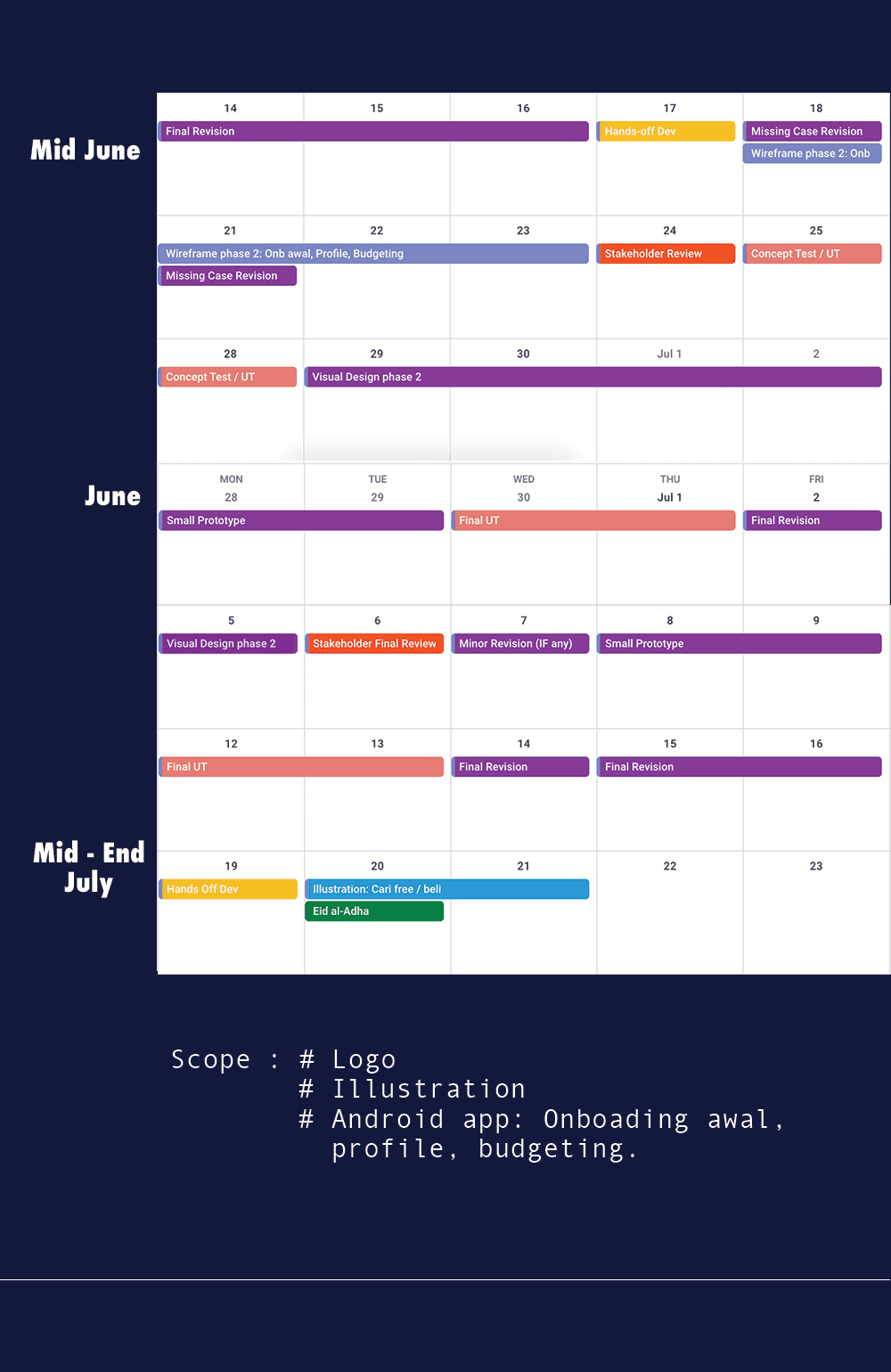
Research & Design Timeline: 5 days logo design · 3 days UX research · 2 days UT · 2 months app design · 1.5 months website design.
About Pocket.id 💰: An Indonesian fintech app to help users control their cashflow better: tracking spending by category, managing income, and splitting money within a family. I owned this project end-to-end: from naming and brand identity, to the full V1 mobile app, to the company website.
Background
Pocket.id is an early-stage Indonesian fintech app built around a simple premise: money management shouldn't feel like accounting. The vision was a cashflow app that works naturally for how people actually spend: by category, by habit, by family. And a brand presence trustworthy enough to earn user confidence before the app even launched.
I came in as the sole senior designer across the entire product surface: responsible for naming, brand identity, the full V1 app design, and the company website: while supervising a junior designer on a remote workstream.
Problem
Two distinct challenges defined this engagement, one per deliverable.
For the app: Most budgeting apps ask users to think like accountants: inputting every transaction manually, reconciling totals, reviewing dense charts. But the real behavior is simpler: people mentally split their money into buckets. "This month's transport. Food. Shopping." They don't need a ledger: they need a system that matches how they already think.
On top of that, this was a full 0-to-1 build: no existing users, no benchmarks, no historical behavior to design against. Every decision had to be grounded in research and stress-tested through concept testing: including flows most designers skip, like error states and edge cases.
For the website: The harder brief: how do you design a company website for an app that hasn't launched yet? No screenshots, no user reviews, no proof points. The only tool available was trust, and trust had to be designed deliberately.
💡 People doesn't have a reliable app to track their spending across bank
Solution
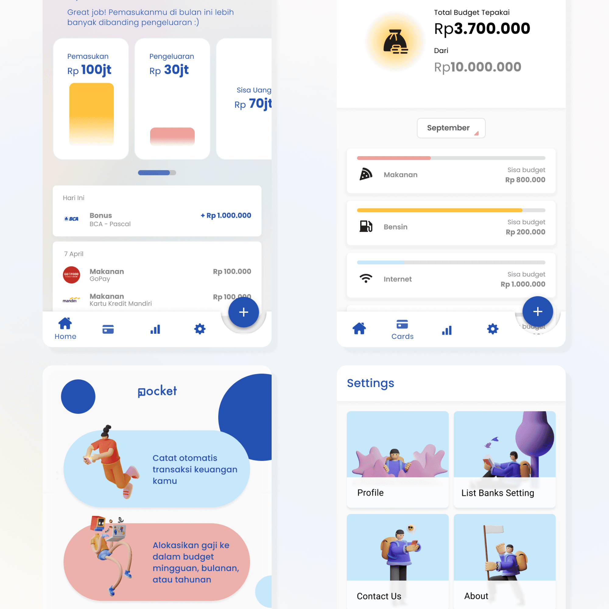
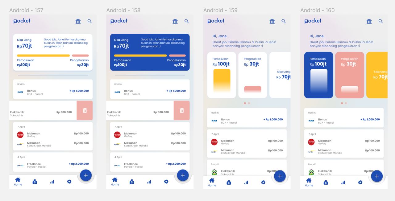
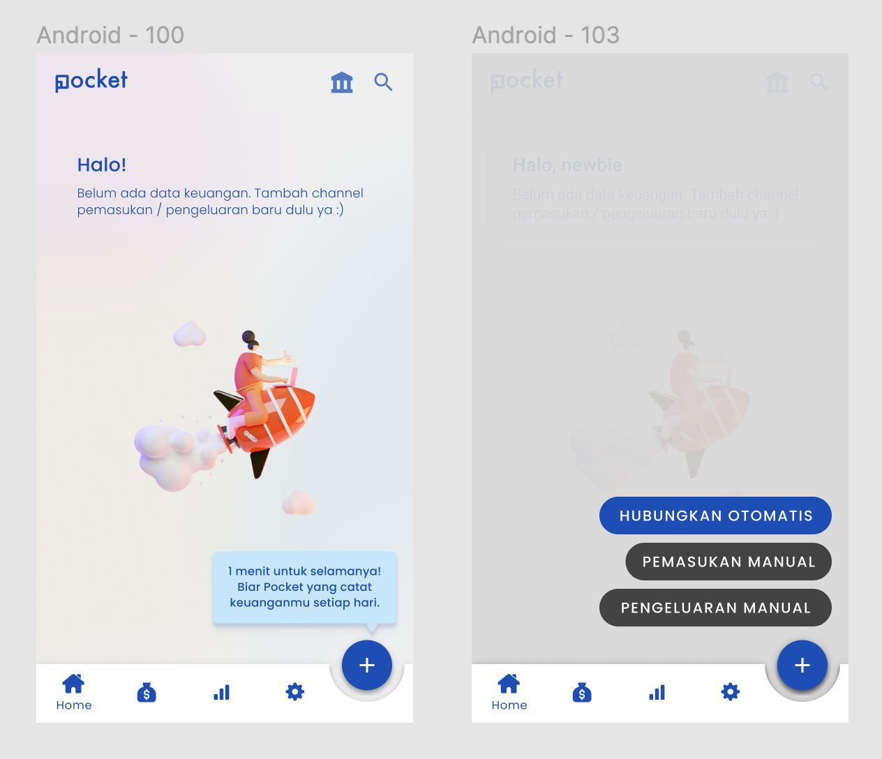
App: A cashflow product centered on category-based budgeting: letting users allocate spending limits per bucket (transport, food, shopping, etc.) and track progress in real time, with automatic spending detection to minimize manual input.
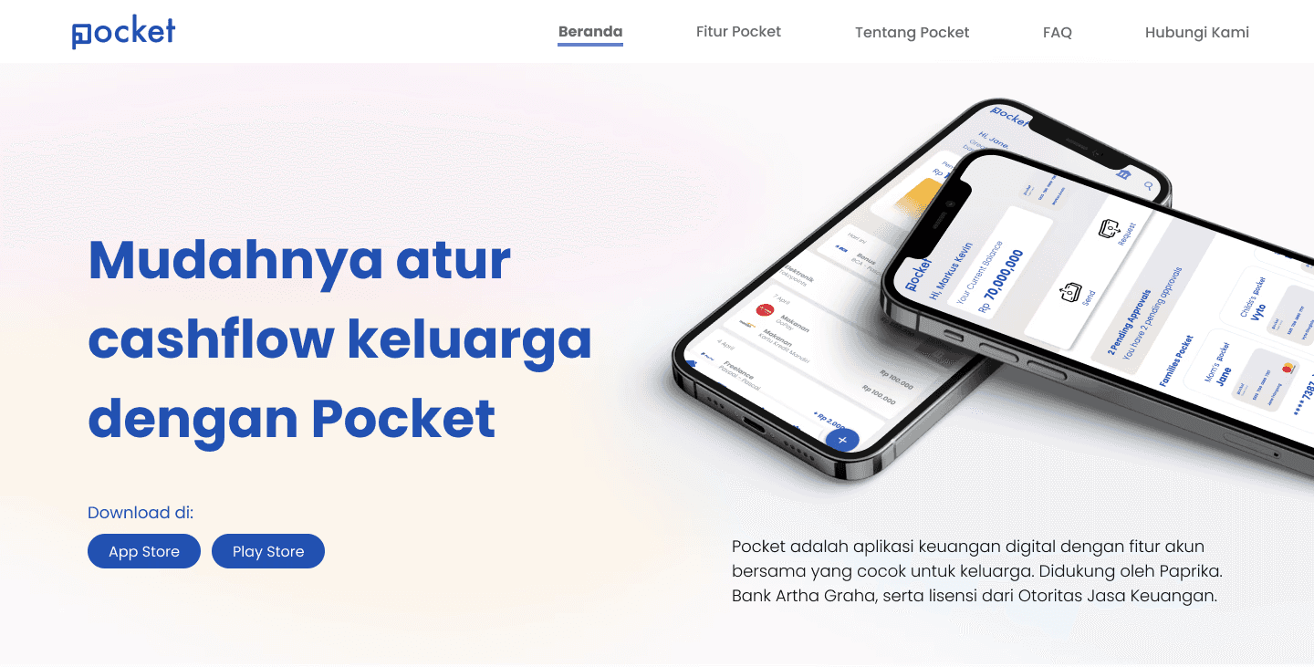
Website: A sleek, compact company profile built around trustworthy content, positioning Pocket.id as credible and safe before a single user had onboarded.
💡 One of many homepage explorations
Design Process
Chapter 1 — Naming, Brand & Mobile App
Naming & Identity
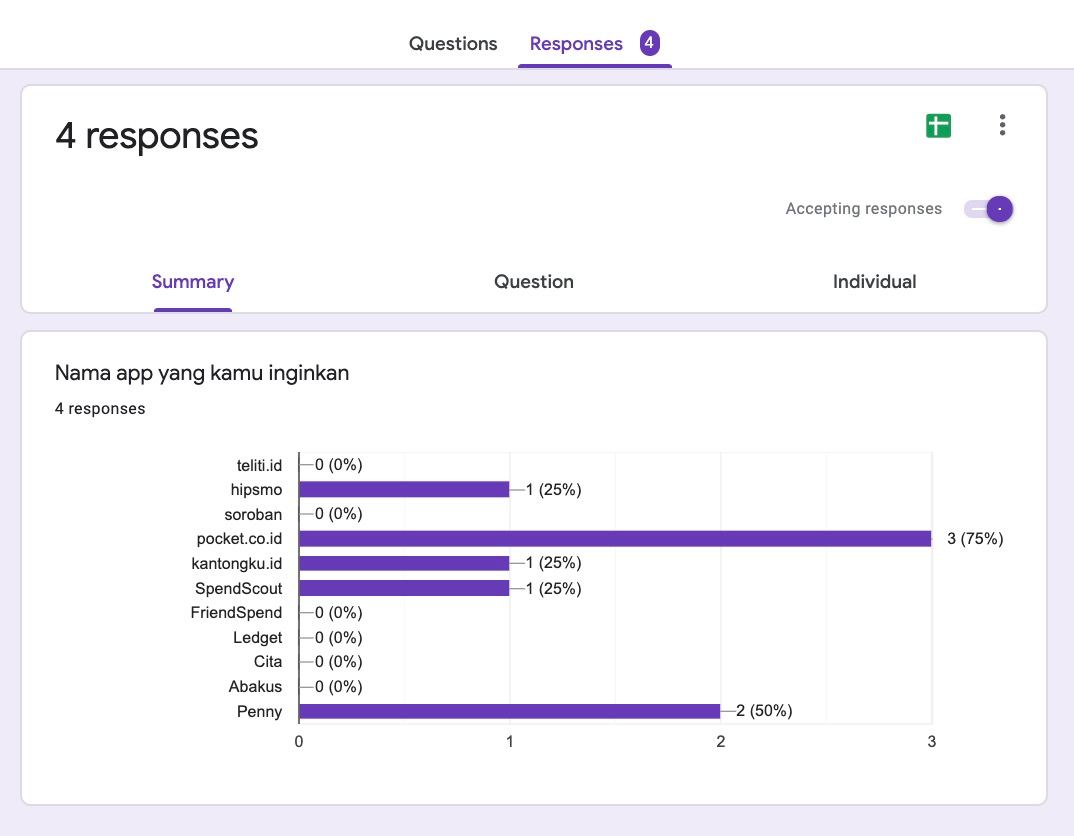
Started with a collaborative naming session with the founding team: running a structured name voting process across candidates before converging on "Pocket." The name was chosen for its immediacy and the intuitive metaphor it carries: keeping money close, organized, and accessible.
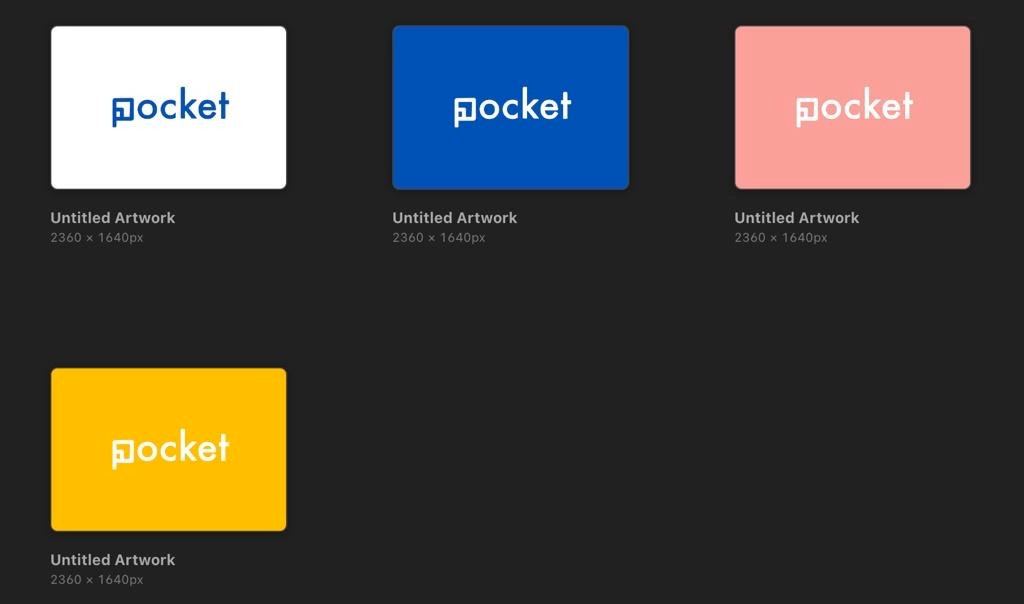
Logo design followed a full exploration arc: moodboard → sketch → visual refinement, completed in 5 days. Multiple directions were explored before landing on a mark that felt both trustworthy and approachable for a finance product targeting everyday users.
Research
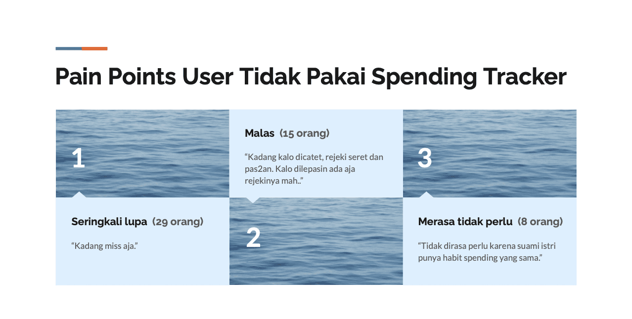
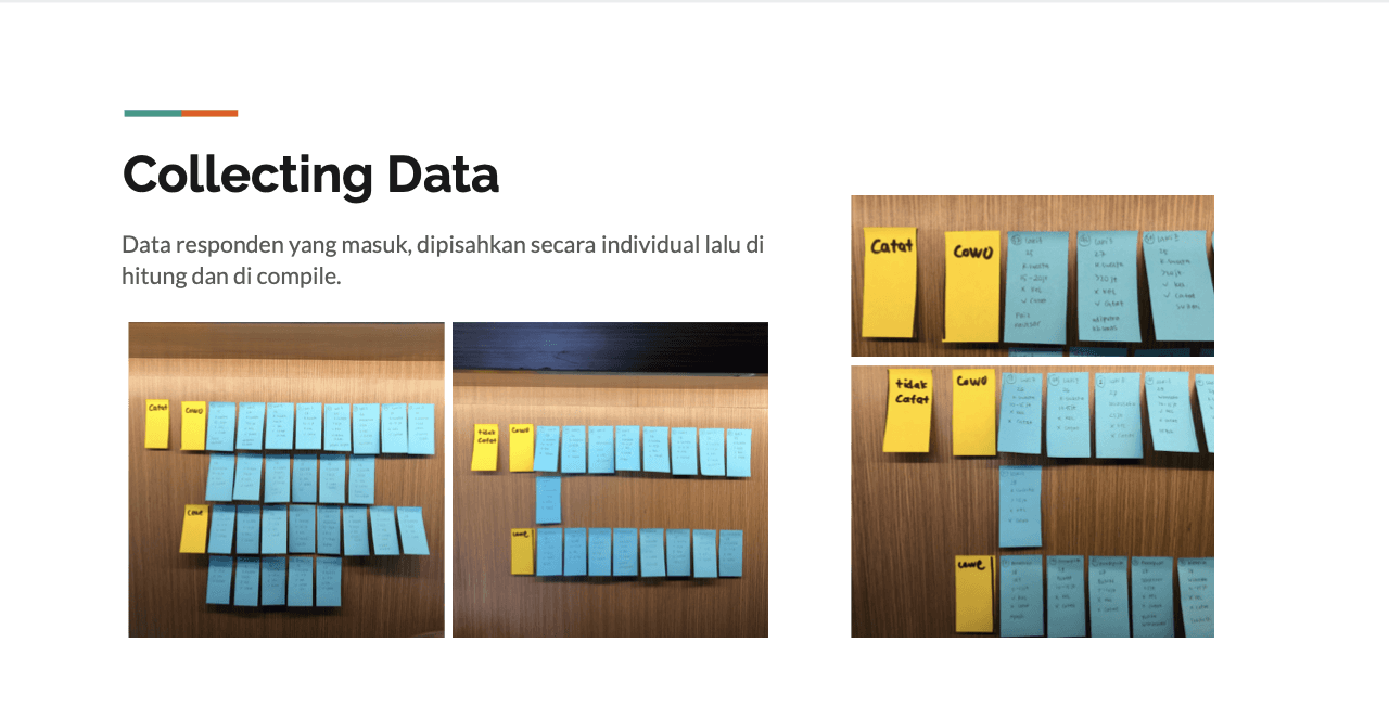
Ran UX research over 3 focused days: understanding how users mentally categorize spending, what makes them abandon existing budgeting tools, and where automatic tracking could reduce friction. Competitive analysis mapped local and global budgeting apps: identifying gaps in simplicity and category flexibility that became design principles for Pocket.id.
Key insight: users don't think in transactions, they think in categories. Transport. Makan. Belanja. The app needed to reflect that mental model, not override it.
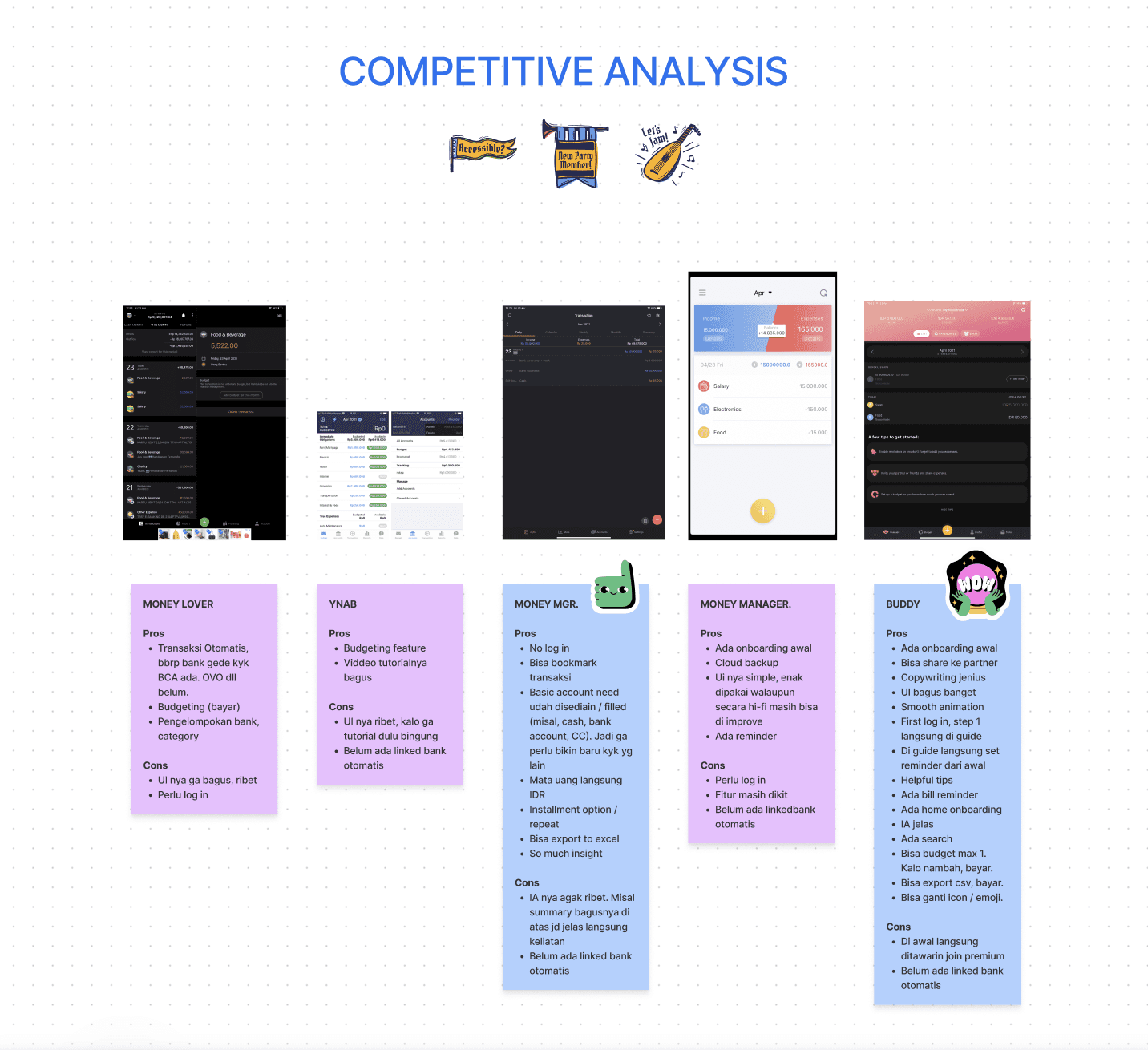
💡 Benchmarking, survey, collect data & learning user flow behaviour
Design
Built full user flow and IA before touching screens: mapping happy path and corner cases upfront, so edge states were never an afterthought
Ran multiple explorations across onboarding, homepage layout, tooltip patterns, and FAB options before converging
Wireframes → concept test → Hi-Fi → final UT, across a 2-month design sprint
Supervised a junior designer on a parallel app workstream: tracking progress via detailed Google Sheets (per-screen status, revision notes, dev handoff notes) and weekly syncs — maintaining output quality without micromanaging
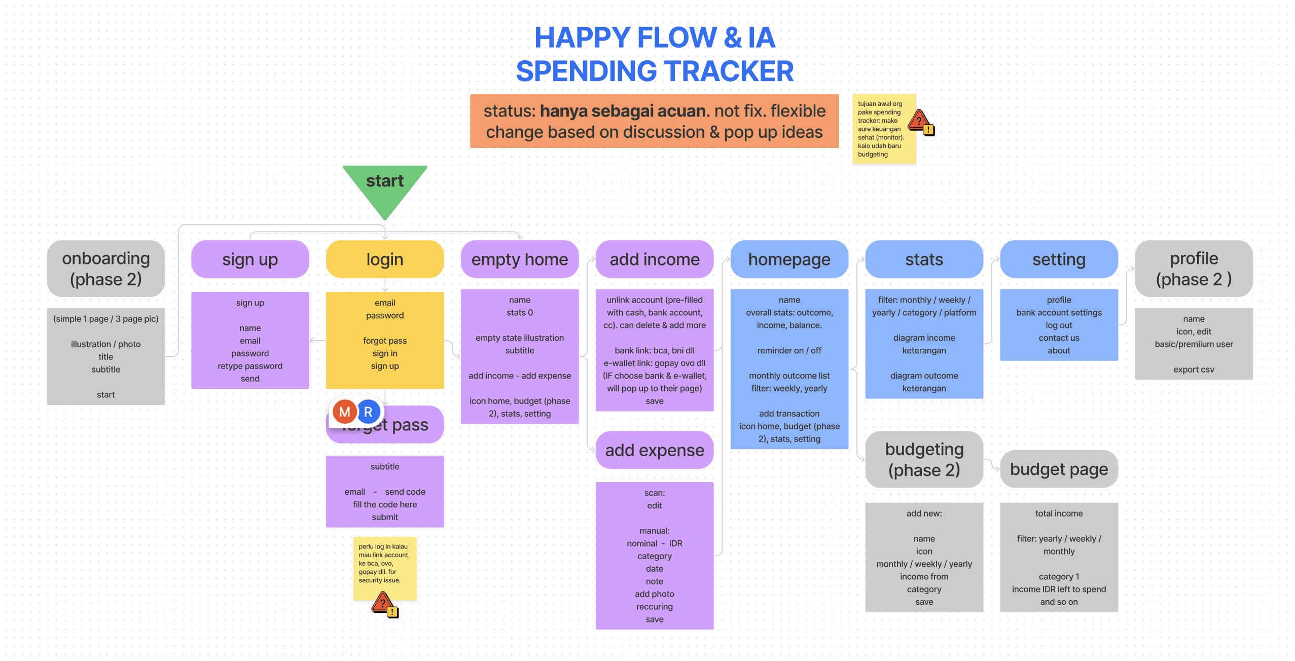
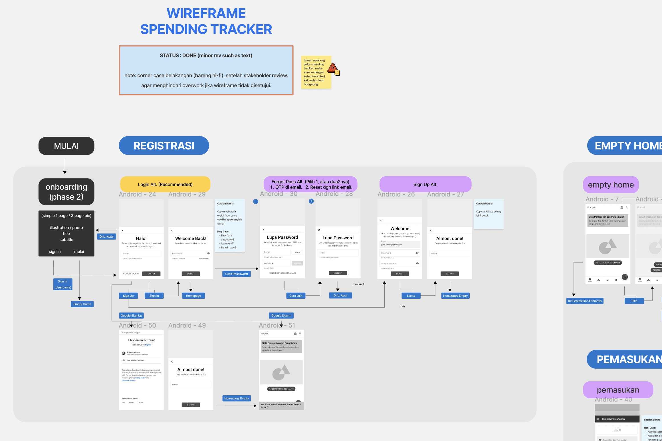
💡 Information Architecture / Happy Flow and Wireframe process
Testing
Two rounds of user testing: an early concept test to validate the category-based budgeting model, and a final UT before handoff to validate flows and interaction details.

💡 Output of Pocket ID Mobile app
Chapter 2 — Company Website
The challenge
Designing a website for a product with no live screenshots, no user testimonials, and no track record. The brief was essentially: make people trust us enough to wait.
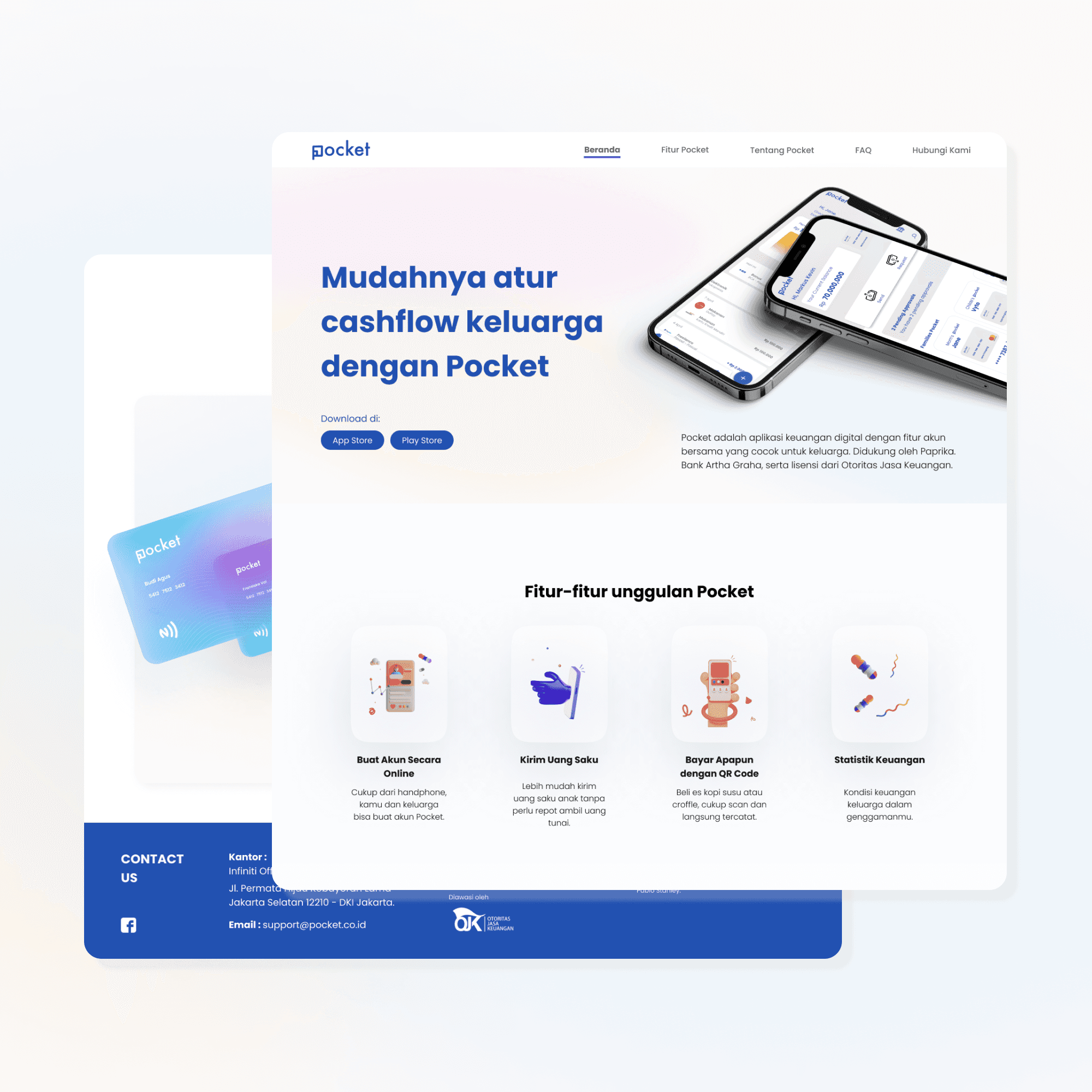
💡 Pocket ID website V.1
Design approach
Conducted competitive analysis of similar fintech websites to identify what signals credibility in the category
Built IA and wireframes focused on featuring Pocket.id's strongest differentiators, as the primary hook
Made a deliberate call to surface bank banking and wallet partners (Arta Graha, Paprika) prominently. Because in fintech, institutional backing is trust. Users may not know the product yet, but they know what regulated financial partnerships signal
Explored multiple Hi-Fi directions before converging on a sleek, compact visual language: clean enough to feel modern, structured enough to feel safe
Collaborated with a copywriter (Ira Indah) by providing dummy copy as directional brief, then aligning on final copy with the team
Supervised junior designer Kenny V. on the app workstream simultaneously throughout this phase
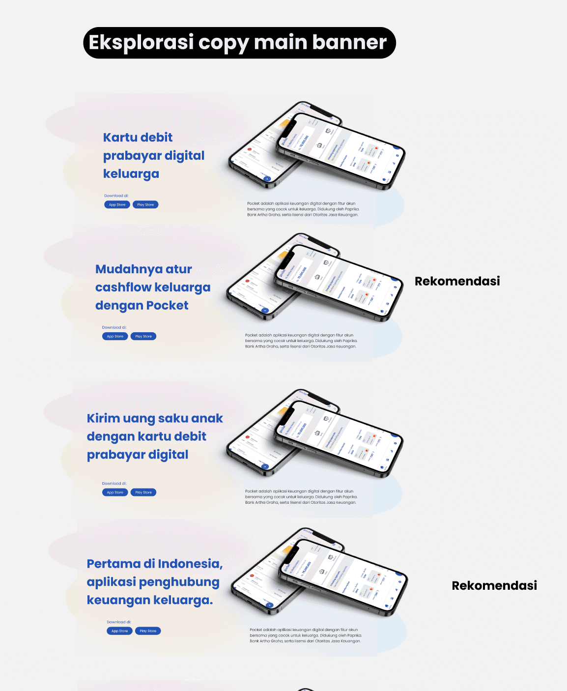
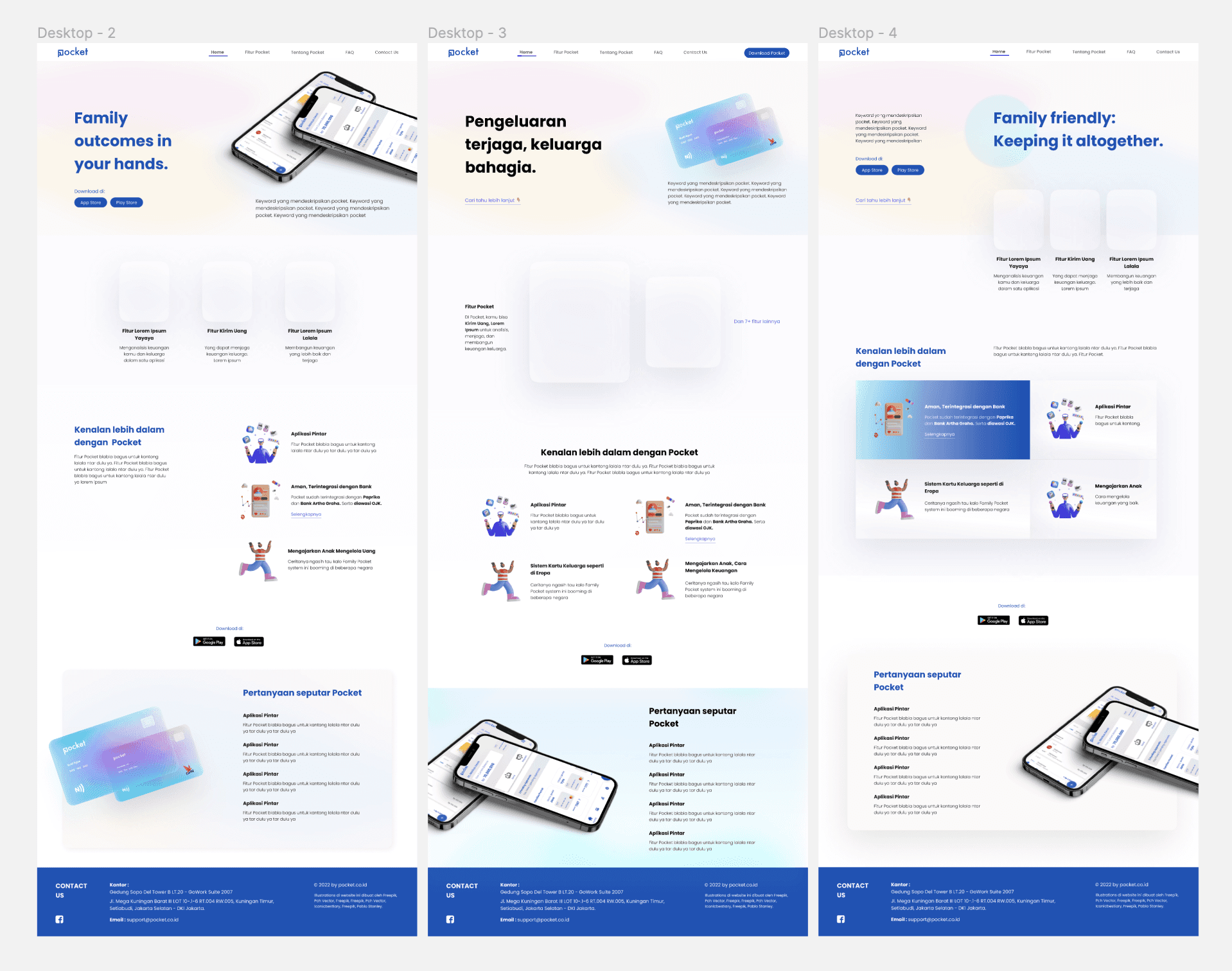
💡 Some of website visual explorations
Output
The website launched successfully. The final result was a clean, trustworthy company profile that communicated the app's vision and credibility.
→ Live at pocket.co.id
Impacts
The V1 app was completed and handed off. The website launched and remains live. For me, this engagement demonstrated across both deliverables:
Trust as a design problem
Making deliberate, strategic choices to build credibility for a product that had no social proof yet.End-to-end product ownership
From brand naming and logo to full app UX to company website, all under one lead designer.0-to-1 discipline
Structured process under tight timelines: 5 days logo, 3 days research, 2 months full app, 1.5 months website.Design leadership
Supervising a junior designer remotely across a parallel workstream while managing my own deliverables
" width="11.000000142661634px"><g opacity="0.996"><path d="M 5.594 0 L 6.31 0.036 C 6.345 0.099 6.42 0.123 6.536 0.108 C 6.892 0.248 7.175 0.458 7.384 0.74 C 7.606 1.044 7.757 1.417 7.836 1.858 C 7.821 2.065 7.846 2.234 7.911 2.363 L 7.911 3.626 L 7.873 3.662 L 7.836 4.131 L 7.685 4.601 L 7.252 5.16 C 7.018 5.357 6.717 5.489 6.348 5.557 L 5.519 5.557 L 5.029 5.34 L 4.916 5.34 L 4.596 5.521 C 4.421 5.745 4.358 6.088 4.408 6.549 L 4.596 7.595 L 4.822 8.173 L 4.822 8.281 C 4.97 8.692 5.203 9.023 5.519 9.273 C 5.648 9.378 5.849 9.414 6.122 9.381 L 6.178 9.327 C 6.162 9.156 6.187 9.024 6.253 8.93 L 6.687 8.443 C 6.915 8.241 7.204 8.097 7.553 8.01 C 7.741 7.95 7.98 7.938 8.269 7.974 C 8.743 8.097 9.113 8.32 9.38 8.642 L 9.531 8.822 C 10.002 9.345 10.391 9.946 10.699 10.626 L 10.925 11.276 L 10.925 11.817 C 10.826 12.192 10.644 12.486 10.378 12.701 C 10.121 12.924 9.82 13.104 9.474 13.242 L 8.231 13.675 L 7.666 13.747 L 7.515 13.82 L 7.252 13.82 L 7.026 13.892 L 6.649 13.892 L 6.611 13.928 L 6.084 13.964 L 6.046 13.928 L 5.217 13.892 L 4.238 13.603 C 3.671 13.361 3.187 13.048 2.788 12.665 C 1.88 11.76 1.177 10.647 0.678 9.327 C 0.428 8.689 0.24 7.991 0.113 7.235 L 0.075 6.621 L 0.038 6.585 L 0 5.286 L 0.038 5.25 L 0.075 4.384 L 0.339 3.446 C 0.545 2.989 0.796 2.586 1.092 2.237 C 1.16 2.264 1.185 2.246 1.168 2.183 C 1.589 1.732 2.085 1.354 2.656 1.046 L 4.125 0.397 L 4.464 0.325 L 4.577 0.253 L 4.728 0.253 L 5.293 0.036 C 5.45 0.078 5.55 0.066 5.594 0 Z M 5.801 0.974 C 5.626 0.974 5.513 1.022 5.462 1.119 C 5.387 1.095 5.362 1.119 5.387 1.191 L 5.312 1.191 L 5.199 1.443 L 5.199 2.562 L 5.236 2.598 L 5.274 3.5 L 5.312 3.536 L 5.387 4.149 L 5.5 4.438 C 5.6 4.582 5.826 4.631 6.178 4.582 L 6.253 4.582 L 6.517 4.474 L 6.743 4.149 L 6.856 3.608 C 6.881 3.055 6.869 2.562 6.818 2.129 C 6.793 1.768 6.693 1.491 6.517 1.299 C 6.442 1.131 6.304 1.034 6.103 1.01 L 6.027 1.01 Z M 4.219 1.443 C 3.491 1.708 2.863 2.057 2.336 2.49 C 1.909 2.875 1.57 3.344 1.318 3.897 C 1.193 4.186 1.118 4.522 1.092 4.907 L 1.092 6.423 C 1.168 6.615 1.193 6.856 1.168 7.144 L 1.243 7.325 L 1.318 7.866 C 1.62 9.093 2.11 10.151 2.788 11.041 C 2.763 11.089 2.788 11.101 2.863 11.077 C 3.089 11.486 3.39 11.835 3.767 12.124 C 3.817 12.1 3.83 12.124 3.805 12.196 L 4.671 12.701 C 4.973 12.821 5.337 12.905 5.764 12.954 C 6.618 12.978 7.358 12.893 7.986 12.701 C 8.087 12.725 8.124 12.701 8.099 12.629 L 8.062 12.629 L 7.723 12.34 C 7.748 12.268 7.723 12.244 7.647 12.268 C 7.17 11.739 6.768 11.125 6.442 10.428 L 6.404 10.356 L 5.538 10.356 C 5.186 10.259 4.91 10.103 4.709 9.887 L 4.596 9.814 C 4.269 9.454 4.006 9.045 3.805 8.588 L 3.654 8.01 L 3.579 7.902 L 3.579 7.722 L 3.503 7.577 L 3.503 7.397 L 3.428 7.216 C 3.453 7 3.428 6.844 3.353 6.747 C 3.277 5.954 3.403 5.364 3.729 4.979 C 3.905 4.739 4.144 4.57 4.445 4.474 L 4.332 3.933 L 4.295 3.392 L 4.257 3.356 L 4.257 1.624 L 4.295 1.588 C 4.345 1.467 4.32 1.419 4.219 1.443 Z M 7.873 8.948 L 7.685 9.057 C 7.584 9.033 7.547 9.057 7.572 9.129 L 7.459 9.165 C 7.333 9.237 7.245 9.357 7.195 9.526 C 7.22 9.814 7.296 10.067 7.421 10.284 L 8.099 11.33 L 8.589 11.871 L 9.041 12.196 L 9.342 12.196 L 9.606 12.015 L 9.719 11.943 C 9.795 11.871 9.845 11.775 9.87 11.655 L 9.832 11.294 L 9.606 10.753 C 9.305 10.199 8.966 9.694 8.589 9.237 L 8.212 8.985 Z" fill="rgb(17, 30, 137)" height="13.963917466353273px" id="Ax8QfdOjo" stroke-dasharray="" stroke-linecap="butt" stroke-linejoin="miter" stroke-miterlimit="10" stroke-width="0.06" stroke="rgb(17, 30, 137)" transform="translate(0.038 0.036)" width="10.924657232911954px"/></g><g opacity="0.545"><path d="M 5.406 0 L 5.462 0.018 L 5.406 0.036 Z M 6.122 0 L 6.216 0.018 L 6.122 0.036 Z M 7.365 0.686 L 7.402 0.758 M 1.978 1.443 L 1.94 1.515 M 1.789 1.588 L 1.752 1.66 M 1.488 1.84 L 1.375 1.985 M 7.854 1.948 L 7.873 2.003 L 7.836 2.003 Z M 0.998 2.345 L 0.961 2.418 M 2.543 2.634 L 2.317 2.887 M 3.522 2.706 L 3.485 2.778 M 3.146 2.995 L 3.108 3.067 M 2.015 3.211 L 1.978 3.284 M 2.693 3.428 L 2.656 3.5 M 7.854 3.969 L 7.873 4.059 L 7.836 4.059 Z M 0.057 4.51 L 0.075 4.564 L 0.038 4.564 Z M 7.553 4.835 L 7.515 4.907 M 0.019 4.907 L 0.038 4.961 L 0 4.961 Z M 7.44 4.979 L 7.327 5.124 M 4.841 5.376 L 4.803 5.448 M 5.594 5.557 L 5.651 5.575 L 5.594 5.593 Z M 4.426 6.098 L 4.445 6.188 L 4.408 6.188 Z M 4.426 6.242 L 4.445 6.369 L 4.408 6.369 Z M 0.019 6.351 L 0.038 6.441 L 0 6.441 Z M 0.057 6.747 L 0.075 6.802 L 0.038 6.802 Z M 0.132 7.325 L 0.151 7.379 L 0.113 7.379 Z M 7.817 7.938 L 8.137 7.956 L 7.817 7.974 Z M 6.687 8.407 L 6.649 8.479 M 9.286 8.515 L 9.361 8.624 M 6.423 8.66 L 6.385 8.732 M 5.142 8.804 L 5.18 8.876 M 6.159 9.237 L 6.178 9.291 L 6.14 9.291 Z M 5.858 9.345 L 6.103 9.363 L 5.858 9.381 Z M 10.943 11.402 L 10.962 11.673 L 10.925 11.673 Z M 7.365 13.82 L 7.421 13.838 L 7.365 13.856 Z M 5.368 13.892 L 5.462 13.91 L 5.368 13.928 Z M 6.8 13.892 L 6.856 13.91 L 6.8 13.928 Z" fill="rgb(62, 73, 141)" height="13.927834717268794px" id="LPkTtYxuQ" stroke-dasharray="" stroke-linecap="butt" stroke-linejoin="miter" stroke-miterlimit="10" stroke-width="0.06" stroke="rgb(62, 73, 141)" transform="translate(0.038 0.036)" width="10.962328099814954px"/></g><g opacity="0.996"><path d="M 4.69 0 L 4.916 0.036 L 4.973 0.018 L 4.86 0.162 C 4.891 0.277 4.878 0.349 4.822 0.379 L 4.822 1.353 L 4.86 1.389 L 4.86 2.219 C 4.932 2.354 4.957 2.534 4.935 2.76 L 5.048 3.374 L 5.161 3.59 L 5.067 3.608 C 4.734 3.656 4.514 3.608 4.408 3.464 L 4.295 3.157 L 4.219 2.544 L 4.182 2.508 L 4.144 1.606 L 4.106 1.57 L 4.106 0.451 L 4.219 0.216 L 4.295 0.216 C 4.266 0.152 4.285 0.128 4.351 0.144 C 4.421 0.055 4.534 0.007 4.69 0 Z M 5.029 0.036 C 5.199 0.09 5.33 0.18 5.425 0.307 L 5.255 0.18 L 5.029 0.072 Z M 5.443 0.361 L 5.481 0.433 M 3.108 0.469 C 3.213 0.438 3.244 0.48 3.202 0.595 L 3.164 0.631 L 3.164 2.363 L 3.202 2.399 L 3.24 2.941 L 3.353 3.5 C 3.061 3.596 2.822 3.758 2.637 3.987 C 2.306 4.38 2.181 4.969 2.26 5.755 C 2.327 5.871 2.352 6.028 2.336 6.224 L 2.411 6.405 L 2.411 6.585 L 2.486 6.729 L 2.486 6.91 L 2.562 7.018 L 2.712 7.595 C 2.903 8.074 3.16 8.489 3.485 8.84 L 3.598 8.912 C 3.808 9.132 4.084 9.288 4.426 9.381 L 5.293 9.381 L 5.349 9.436 C 5.663 10.15 6.065 10.769 6.555 11.294 C 6.622 11.267 6.647 11.285 6.63 11.348 L 6.95 11.655 L 7.007 11.655 C 7.04 11.735 6.996 11.759 6.875 11.727 C 6.249 11.921 5.509 12.006 4.652 11.979 C 4.243 11.938 3.879 11.854 3.56 11.727 L 2.712 11.222 C 2.741 11.157 2.722 11.133 2.656 11.149 C 2.283 10.858 1.988 10.51 1.771 10.103 C 1.703 10.13 1.678 10.112 1.695 10.049 C 1.028 9.161 0.538 8.102 0.226 6.874 L 0.151 6.332 L 0.075 6.152 C 0.096 5.867 0.071 5.627 0 5.43 L 0 3.915 C 0.034 3.538 0.109 3.202 0.226 2.905 C 0.466 2.353 0.799 1.89 1.224 1.515 C 1.758 1.076 2.386 0.727 3.108 0.469 Z M 2.449 1.01 C 1.946 1.227 1.532 1.527 1.205 1.912 C 1.231 1.96 1.205 1.973 1.13 1.948 L 0.678 2.634 L 0.339 3.572 L 0.377 3.897 L 0.603 4.005 L 0.904 3.969 L 1.055 3.825 C 1.13 3.247 1.318 2.79 1.62 2.454 L 2.26 1.876 L 2.788 1.624 L 2.938 1.479 C 2.963 1.287 2.938 1.155 2.863 1.082 C 2.788 1.01 2.65 0.986 2.449 1.01 Z M 5.594 0.613 L 5.613 0.668 L 5.575 0.668 Z M 5.632 0.722 L 5.651 0.776 L 5.613 0.776 Z M 5.67 0.902 L 5.688 1.028 L 5.651 1.028 Z M 5.707 1.119 L 5.726 1.281 L 5.688 1.281 Z M 5.745 1.479 L 5.764 2.616 L 5.726 2.616 Z M 5.707 2.778 L 5.726 2.869 L 5.688 2.869 Z M 5.67 2.923 L 5.688 3.013 L 5.651 3.013 Z M 5.632 3.103 L 5.651 3.157 L 5.594 3.247 L 5.575 3.193 Z M 5.557 3.284 L 5.519 3.356 M 5.481 3.392 L 5.406 3.5 L 5.33 3.536 L 5.368 3.464 Z M 6.762 7.974 L 7.007 7.992 L 6.762 8.01 Z M 6.649 8.01 L 6.63 8.064 L 6.705 8.461 L 7.158 9.255 L 7.873 10.302 L 8.382 10.825 L 8.608 10.933 L 8.683 10.825 L 8.702 10.879 L 8.551 10.969 C 8.58 11.033 8.561 11.057 8.495 11.041 L 8.231 11.222 L 7.93 11.222 L 7.497 10.879 L 7.007 10.338 L 6.329 9.291 C 6.197 9.092 6.122 8.84 6.103 8.534 C 6.141 8.378 6.223 8.264 6.348 8.191 L 6.479 8.155 C 6.448 8.082 6.479 8.058 6.574 8.082 Z M 7.252 8.082 L 7.365 8.227 M 7.44 8.263 C 7.497 8.245 7.515 8.263 7.497 8.317 L 7.798 8.642 L 7.647 8.534 Z M 7.817 8.696 L 7.854 8.768 M 7.892 8.804 L 7.93 8.876 M 7.967 8.912 L 8.005 8.985 M 8.043 9.021 L 8.08 9.093 M 8.118 9.129 L 8.212 9.255 L 8.137 9.219 Z M 8.269 9.381 L 8.363 9.508 L 8.288 9.472 Z M 8.457 9.706 L 8.514 9.796 L 8.476 9.796 Z M 8.533 9.851 L 8.589 9.941 L 8.551 9.941 Z M 8.608 9.995 L 8.664 10.121 L 8.627 10.121 Z M 8.683 10.175 L 8.702 10.229 L 8.664 10.229 Z M 8.721 10.284 L 8.74 10.338 L 8.702 10.338 Z M 8.759 10.428 L 8.777 10.662 L 8.74 10.662 Z" fill="rgb(47, 91, 188)" height="11.984050498615659px" id="qKAurkFxx" stroke-dasharray="" stroke-linecap="butt" stroke-linejoin="miter" stroke-miterlimit="10" stroke-width="0.06" stroke="rgb(47, 91, 188)" transform="translate(1.13 1.01)" width="8.77739825209764px"/></g><g opacity="0.165"><path d="M 5.557 0 L 5.651 0.018 L 5.557 0.036 Z M 6.009 0 L 6.103 0.018 L 6.009 0.036 Z M 4.878 0.18 L 4.973 0.198 L 4.878 0.216 Z M 4.351 0.325 L 4.408 0.343 L 4.351 0.361 Z M 7.101 0.397 L 7.139 0.469 M 7.478 0.794 L 7.515 0.866 M 2.091 1.407 L 2.053 1.479 M 1.94 1.515 L 1.902 1.588 M 7.817 1.515 L 7.836 1.57 L 7.798 1.57 Z M 1.714 1.696 L 1.676 1.768 M 7.892 1.84 L 7.911 1.93 L 7.873 1.93 Z M 7.93 2.093 L 7.949 2.147 L 7.911 2.147 Z M 1.111 2.273 L 1.074 2.345 M 3.07 2.309 L 3.033 2.381 M 0.961 2.454 L 0.923 2.526 M 4.012 2.49 L 3.937 2.598 M 2.769 2.526 L 2.58 2.742 M 7.967 2.526 L 7.986 2.652 L 7.949 2.652 Z M 0.885 2.562 L 0.848 2.634 M 3.522 2.742 L 3.485 2.814 M 3.334 2.887 L 3.296 2.959 M 2.354 2.923 L 2.204 3.103 M 3.108 3.067 L 3.07 3.139 M 2.053 3.284 L 2.015 3.356 M 2.769 3.392 L 2.731 3.464 M 7.967 3.428 L 7.986 3.554 L 7.949 3.554 Z M 2.656 3.536 L 2.618 3.608 M 0.17 4.005 L 0.188 4.059 L 0.151 4.059 Z M 2.354 4.077 L 2.373 4.131 L 2.336 4.131 Z M 7.892 4.149 L 7.911 4.204 L 7.873 4.204 Z M 2.279 4.294 L 2.298 4.348 L 2.26 4.348 Z M 0.094 4.366 L 0.113 4.456 L 0.075 4.456 Z M 7.817 4.438 L 7.836 4.492 L 7.798 4.492 Z M 2.204 4.582 L 2.223 4.637 L 2.185 4.637 Z M 1.488 4.619 L 1.507 4.709 L 1.469 4.709 Z M 0.057 4.799 L 0.075 4.853 L 0.038 4.853 Z M 7.666 4.799 L 7.628 4.871 M 2.128 4.835 L 2.053 4.943 M 1.789 4.979 L 1.884 4.997 L 1.789 5.015 Z M 0.019 5.124 L 0.038 6.224 L 0 6.224 Z M 7.214 5.268 L 7.176 5.34 M 6.536 5.557 L 6.592 5.575 L 6.536 5.593 Z M 5.783 5.629 L 6.216 5.647 L 5.783 5.665 Z M 4.502 5.954 L 4.521 6.08 L 4.483 6.08 Z M 4.502 6.495 L 4.521 6.693 L 4.483 6.693 Z M 0.057 6.567 L 0.075 6.621 L 0.038 6.621 Z M 0.094 6.964 L 0.113 7.054 L 0.075 7.054 Z M 4.577 7.072 L 4.596 7.162 L 4.558 7.162 Z M 0.132 7.18 L 0.151 7.235 L 0.113 7.235 Z M 4.652 7.433 L 4.671 7.487 L 4.634 7.487 Z M 0.17 7.469 L 0.188 7.523 L 0.151 7.523 Z M 4.728 7.722 L 4.747 7.776 L 4.709 7.776 Z M 8.834 8.155 L 8.872 8.227 M 0.358 8.299 L 0.377 8.353 L 0.339 8.353 Z M 6.837 8.335 L 6.8 8.407 M 9.135 8.371 L 9.173 8.443 M 6.649 8.479 L 6.498 8.66 M 0.433 8.552 L 0.452 8.606 L 0.414 8.606 Z M 6.385 8.768 L 6.348 8.84 M 0.509 8.804 L 0.527 8.858 L 0.49 8.858 Z M 0.584 9.021 L 0.603 9.075 L 0.565 9.075 Z M 5.33 9.021 L 5.406 9.129 M 6.197 9.129 L 6.216 9.183 L 6.178 9.183 Z M 5.519 9.201 L 5.557 9.273 M 0.659 9.237 L 0.678 9.291 L 0.64 9.291 Z M 5.783 9.345 L 5.839 9.363 L 5.783 9.381 Z M 10.265 9.742 L 10.303 9.814 M 10.83 10.789 L 10.849 10.843 L 10.812 10.843 Z M 10.906 11.005 L 10.925 11.059 L 10.887 11.059 Z M 10.981 11.258 L 11 11.348 L 10.962 11.348 Z M 1.714 11.366 L 1.752 11.438 M 1.865 11.582 L 1.902 11.655 M 10.981 11.799 L 11 11.889 L 10.962 11.889 Z M 2.279 12.124 L 2.354 12.232 M 2.505 12.376 L 2.58 12.485 M 10.68 12.485 L 10.642 12.557 M 2.882 12.737 L 3.033 12.918 M 10.341 12.809 L 10.303 12.881 M 10.19 12.918 L 10.152 12.99 M 3.221 13.026 L 3.259 13.098 M 3.522 13.242 L 3.56 13.314 M 9.587 13.242 L 9.644 13.26 L 9.587 13.278 Z M 3.748 13.387 L 3.786 13.459 M 8.269 13.711 L 8.325 13.729 L 8.269 13.747 Z M 7.892 13.784 L 7.986 13.802 L 7.892 13.82 Z M 4.916 13.856 L 4.973 13.874 L 4.916 13.892 Z M 7.515 13.856 L 7.61 13.874 L 7.515 13.892 Z M 5.293 13.928 L 5.349 13.946 L 5.293 13.964 Z M 5.557 13.964 L 5.651 13.982 L 5.557 14 Z M 6.649 13.964 L 6.743 13.982 L 6.649 14 Z" fill="rgb(140, 146, 200)" height="13.999999252791248px" id="gCaYAt4oi" stroke-dasharray="" stroke-linecap="butt" stroke-linejoin="miter" stroke-miterlimit="10" stroke-width="0.06" stroke="rgb(140, 146, 200)" width="11.000000142661634px"/></g><path d="M 0.113 0 C 0.318 0.045 0.481 0.148 0.603 0.307 L 0.829 0.776 C 0.814 0.983 0.839 1.151 0.904 1.281 L 0.904 2.724 L 0.753 3.229 L 0.584 3.428 L 0.301 3.536 L 0.188 3.157 C 0.202 2.975 0.177 2.831 0.113 2.724 L 0.113 2.436 L 0.038 2.183 L 0 0.343 C 0.057 0.313 0.069 0.241 0.038 0.126 Z M 0.377 0.794 C 0.201 0.818 0.088 0.89 0.038 1.01 L 0.113 1.84 L 0.377 1.985 L 0.603 1.948 L 0.716 1.804 L 0.678 1.119 L 0.603 0.902 Z M 1.865 7.974 L 2.241 7.974 L 2.599 8.191 C 2.952 8.576 3.266 9.015 3.541 9.508 L 3.918 10.338 L 3.918 10.698 L 3.786 10.897 C 3.533 10.803 3.338 10.652 3.202 10.446 L 2.562 9.544 L 2.731 9.67 L 2.957 9.706 L 3.127 9.634 L 3.202 9.472 C 3.073 9.15 2.891 8.88 2.656 8.66 L 2.392 8.624 L 2.26 8.696 L 2.166 8.912 C 1.96 8.701 1.841 8.406 1.808 8.028 Z M 2.241 9.021 L 2.279 9.093 M 2.354 9.201 L 2.392 9.273 M 2.505 9.418 L 2.543 9.49" fill="rgb(108, 180, 245)" height="10.89690736397025px" id="WdzeNKHKu" stroke-dasharray="" stroke-linecap="butt" stroke-linejoin="miter" stroke-miterlimit="10" stroke-width="0.06" stroke="rgb(108, 180, 245)" transform="translate(5.952 1.046)" width="3.917813899161814px"/><g opacity="0.792"><path d="M 5.481 0 L 5.575 0.018 L 5.481 0.036 Z M 6.009 0 L 6.103 0.018 L 6.009 0.036 Z M 5.217 0.036 L 5.274 0.054 L 5.217 0.072 Z M 6.423 0.072 L 6.479 0.09 L 6.423 0.108 Z M 6.574 0.108 L 6.668 0.162 L 6.611 0.18 Z M 4.69 0.216 L 4.747 0.235 L 4.69 0.253 Z M 4.426 0.289 L 4.483 0.307 L 4.426 0.325 Z M 7.026 0.361 L 7.327 0.686 M 3.974 0.433 L 4.031 0.451 L 3.974 0.469 Z M 3.786 0.505 L 3.842 0.523 L 3.786 0.541 Z M 7.402 0.758 L 7.44 0.83 M 2.505 1.119 L 2.467 1.191 M 2.317 1.227 L 2.279 1.299 M 7.666 1.227 L 7.685 1.281 L 7.647 1.281 Z M 2.204 1.299 L 2.166 1.371 M 7.704 1.335 L 7.723 1.389 L 7.685 1.389 Z M 2.091 1.371 L 2.053 1.443 M 7.741 1.443 L 7.76 1.497 L 7.723 1.497 Z M 1.902 1.515 L 1.865 1.588 M 7.779 1.624 L 7.798 1.678 L 7.76 1.678 Z M 1.714 1.66 L 1.676 1.732 M 7.817 1.768 L 7.836 1.822 L 7.798 1.822 Z M 7.854 2.021 L 7.873 2.075 L 7.836 2.075 Z M 7.892 2.201 L 7.911 2.327 L 7.873 2.327 Z M 1.074 2.273 L 1.036 2.345 M 0.961 2.418 L 0.923 2.49 M 0.885 2.526 L 0.848 2.598 M 0.772 2.67 L 0.735 2.742 M 0.584 2.959 L 0.565 3.013 L 0.546 3.067 L 0.527 3.013 Z M 7.892 3.644 L 7.911 3.771 L 7.873 3.771 Z M 0.245 3.68 L 0.264 3.735 L 0.226 3.735 Z M 7.854 3.897 L 7.873 3.951 L 7.836 3.951 Z M 0.132 4.113 L 0.151 4.168 L 0.113 4.168 Z M 7.817 4.149 L 7.836 4.204 L 7.798 4.204 Z M 0.094 4.294 L 0.113 4.348 L 0.075 4.348 Z M 7.704 4.51 L 7.723 4.564 L 7.685 4.564 Z M 0.057 4.582 L 0.075 4.745 L 0.038 4.745 Z M 7.591 4.763 L 7.553 4.835 M 7.478 4.907 L 7.44 4.979 M 0.019 4.979 L 0.038 5.25 L 0 5.25 Z M 7.214 5.16 L 7.139 5.268 M 7.063 5.268 L 7.026 5.34 M 4.916 5.34 L 5.048 5.358 L 4.916 5.376 Z M 6.913 5.34 L 6.969 5.358 L 6.875 5.412 Z M 4.765 5.412 L 4.728 5.485 M 6.762 5.412 L 6.818 5.43 L 6.762 5.448 Z M 6.536 5.485 L 6.592 5.503 L 6.536 5.521 Z M 6.385 5.521 L 6.442 5.539 L 6.385 5.557 Z M 5.67 5.557 L 6.253 5.575 L 5.67 5.593 Z M 0.019 5.954 L 0.038 6.332 L 0 6.332 Z M 4.426 5.99 L 4.445 6.08 L 4.408 6.08 Z M 4.426 6.387 L 4.445 6.549 L 4.408 6.549 Z M 0.057 6.603 L 0.075 6.729 L 0.038 6.729 Z M 4.464 6.784 L 4.483 6.874 L 4.445 6.874 Z M 0.094 6.964 L 0.113 7.054 L 0.075 7.054 Z M 4.502 7 L 4.521 7.054 L 4.483 7.054 Z M 4.539 7.216 L 4.558 7.271 L 4.521 7.271 Z M 0.132 7.253 L 0.151 7.307 L 0.113 7.307 Z M 4.577 7.361 L 4.596 7.415 L 4.558 7.415 Z M 0.17 7.469 L 0.188 7.523 L 0.151 7.523 Z M 4.615 7.541 L 4.634 7.595 L 4.596 7.595 Z M 4.652 7.649 L 4.671 7.704 L 4.634 7.704 Z M 0.207 7.686 L 0.226 7.74 L 0.188 7.74 Z M 7.628 7.974 L 7.685 7.992 L 7.628 8.01 Z M 8.307 7.974 L 8.363 7.992 L 8.307 8.01 Z M 0.283 8.01 L 0.301 8.064 L 0.264 8.064 Z M 7.365 8.046 L 7.421 8.064 L 7.365 8.082 Z M 0.32 8.155 L 0.339 8.209 L 0.301 8.209 Z M 8.796 8.155 L 8.834 8.227 M 8.909 8.227 L 8.947 8.299 M 0.358 8.299 L 0.377 8.353 L 0.339 8.353 Z M 6.8 8.335 L 6.724 8.443 M 9.06 8.335 L 9.211 8.515 M 4.916 8.443 L 4.954 8.515 M 6.611 8.479 L 6.461 8.66 M 0.433 8.552 L 0.452 8.606 L 0.414 8.606 Z M 6.385 8.732 L 6.348 8.804 M 9.55 8.804 L 9.587 8.876 M 5.18 8.876 L 5.217 8.948 M 5.255 8.985 L 5.33 9.093 M 9.7 8.985 L 9.738 9.057 M 6.197 9.057 L 6.216 9.111 L 6.178 9.111 Z M 5.481 9.201 L 5.519 9.273 M 9.889 9.237 L 9.926 9.309 M 6.159 9.309 L 6.122 9.381 M 5.783 9.345 L 5.839 9.363 L 5.783 9.381 Z M 9.964 9.345 L 10.002 9.418 M 0.735 9.418 L 0.753 9.472 L 0.716 9.472 Z M 0.81 9.598 L 0.829 9.652 L 0.791 9.652 Z M 0.885 9.778 L 0.904 9.832 L 0.866 9.832 Z M 1.036 10.103 L 1.092 10.193 L 1.017 10.157 Z M 1.262 10.572 L 1.3 10.644 M 1.337 10.716 L 1.375 10.789 M 10.793 10.861 L 10.812 10.915 L 10.774 10.915 Z M 10.868 11.077 L 10.887 11.131 L 10.849 11.131 Z M 1.639 11.222 L 1.676 11.294 M 1.752 11.402 L 1.789 11.474 M 1.827 11.51 L 1.865 11.582 M 1.94 11.655 L 1.978 11.727 M 2.015 11.763 L 2.053 11.835 M 2.128 11.907 L 2.166 11.979 M 10.868 11.943 L 10.887 11.997 L 10.849 11.997 Z M 2.241 12.052 L 2.354 12.196 M 10.793 12.124 L 10.812 12.178 L 10.774 12.178 Z M 10.755 12.232 L 10.717 12.304 M 2.43 12.268 L 2.769 12.629 M 10.604 12.448 L 10.567 12.521 M 2.844 12.665 L 3.033 12.881 M 10.341 12.701 L 10.228 12.845 M 10.152 12.845 L 10.115 12.918 M 3.183 12.954 L 3.259 13.062 M 9.926 12.99 L 9.889 13.062 L 9.813 13.098 L 9.851 13.026 Z M 3.372 13.098 L 3.409 13.17 M 3.485 13.17 L 3.522 13.242 M 9.399 13.242 L 9.455 13.26 L 9.399 13.278 Z M 3.711 13.314 L 3.748 13.387 M 8.834 13.459 L 8.89 13.477 L 8.834 13.495 Z M 8.721 13.495 L 8.777 13.513 L 8.721 13.531 Z M 8.608 13.531 L 8.664 13.549 L 8.608 13.567 Z M 8.495 13.567 L 8.551 13.585 L 8.495 13.603 Z M 4.276 13.603 L 4.332 13.621 L 4.276 13.639 Z M 8.08 13.675 L 8.137 13.693 L 8.08 13.711 Z M 4.577 13.711 L 4.634 13.729 L 4.577 13.747 Z M 7.93 13.711 L 7.986 13.729 L 7.93 13.747 Z M 4.728 13.747 L 4.784 13.765 L 4.728 13.784 Z M 7.666 13.747 L 7.76 13.765 L 7.666 13.784 Z M 7.553 13.784 L 7.61 13.802 L 7.553 13.82 Z M 5.029 13.82 L 5.086 13.838 L 5.029 13.856 Z M 7.252 13.82 L 7.346 13.838 L 7.252 13.856 Z M 5.142 13.856 L 5.199 13.874 L 5.142 13.892 Z M 7.063 13.856 L 7.12 13.874 L 7.063 13.892 Z M 5.481 13.892 L 5.613 13.91 L 5.481 13.928 Z M 6.649 13.892 L 6.781 13.91 L 6.649 13.928 Z M 5.745 13.928 L 6.065 13.946 L 5.745 13.964 Z M 6.31 13.928 L 6.517 13.946 L 6.31 13.964 Z" fill="rgb(29, 36, 117)" height="13.963916031355701px" id="ljZxulQbU" stroke-dasharray="" stroke-linecap="butt" stroke-linejoin="miter" stroke-miterlimit="10" stroke-width="0.06" stroke="rgb(29, 36, 117)" transform="translate(0.038 0.036)" width="10.886985921470227px"/></g><g opacity="0.361"><path d="M 5.632 0 L 5.952 0.018 L 5.632 0.036 Z M 7.139 0.469 L 7.289 0.649 M 1.601 1.768 L 1.526 1.876 M 3.372 2.093 L 3.334 2.165 M 1.149 2.201 L 1.111 2.273 M 2.807 2.454 L 2.769 2.526 M 7.93 2.67 L 7.949 3.41 L 7.911 3.41 Z M 3.409 2.814 L 3.372 2.887 M 3.221 2.959 L 3.183 3.031 M 2.995 3.139 L 2.92 3.247 M 7.892 3.861 L 7.911 3.915 L 7.873 3.915 Z M 0.057 4.474 L 0.075 4.528 L 0.038 4.528 Z M 0.019 4.871 L 0.038 4.925 L 0 4.925 Z M 1.526 4.871 L 1.563 4.943 M 4.652 5.557 L 4.577 5.665 M 6.31 5.593 L 6.366 5.611 L 6.31 5.629 Z M 0.019 6.495 L 0.038 6.549 L 0 6.549 Z M 4.464 6.711 L 4.483 6.765 L 4.445 6.765 Z M 0.057 6.856 L 0.075 6.946 L 0.038 6.946 Z M 4.502 6.964 L 4.521 7.018 L 4.483 7.018 Z M 0.207 7.83 L 0.226 7.884 L 0.188 7.884 Z M 9.173 8.443 L 9.248 8.552 M 9.399 8.66 L 9.55 8.84 M 6.159 9.201 L 6.178 9.255 L 6.14 9.255 Z M 10.943 11.366 L 10.962 11.42 L 10.925 11.42 Z M 10.943 11.727 L 10.962 11.781 L 10.925 11.781 Z M 10.567 12.557 L 10.529 12.629 M 10.378 12.737 L 10.341 12.809 M 3.108 12.954 L 3.146 13.026 M 8.005 13.747 L 8.062 13.765 L 8.005 13.784 Z M 7.176 13.892 L 7.233 13.91 L 7.176 13.928 Z M 6.875 13.928 L 6.932 13.946 L 6.875 13.964 Z M 5.632 13.964 L 5.688 13.982 L 5.632 14 Z" fill="rgb(89, 100, 164)" height="13.999999252791248px" id="mvIBP6GjM" stroke-dasharray="" stroke-linecap="butt" stroke-linejoin="miter" stroke-miterlimit="10" stroke-width="0.06" stroke="rgb(89, 100, 164)" transform="translate(0.038 0)" width="10.962328099814954px"/></g><path d="M 0.32 0 L 0.565 0.108 L 0.64 0.307 L 0.678 0.992 L 0.546 1.155 L 0.32 1.191 L 0.075 1.028 L 0 0.198 C 0.054 0.082 0.161 0.016 0.32 0 Z M 2.354 7.83 C 2.571 7.803 2.703 7.857 2.75 7.992 L 3.164 8.678 L 3.089 8.84 C 3.032 8.902 2.925 8.926 2.769 8.912 L 2.524 8.714 L 2.185 8.209 L 2.147 8.064 L 2.223 7.902 Z" fill="rgb(236, 246, 251)" height="8.916105717512833px" id="n9kFhdC8m" stroke-dasharray="" stroke-linecap="butt" stroke-linejoin="miter" stroke-miterlimit="10" stroke-width="0.06" stroke="rgb(236, 246, 251)" transform="translate(5.99 1.84)" width="3.1643815412255947px"/></g></svg>)